In today’s tutorial, we will learn about TextField in KMP KMM Kotlin Compose Multiplatform for both Android & iOS platforms. TextField is known as EditText in native Android, and in React native, it is known as the TextInput component.

TextField in KMP KMM Kotlin Compose Multiplatform:
TextField is a UI component in KMP that takes user input. In Kotlin’s Multiplatform, there are three types of TextField widgets in KMP: BasicTextField, TextField, and OutlinedTextField. With the combination of different properties on OutlinedTextField, we can make Password TextField and TextField with leading and trialing material icons. Our main purpose in this tutorial is to explain each type of TextField widget and show the TextField entered value in the Text widget on the button click event.
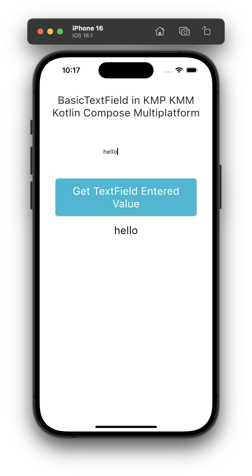
1. BasicTextField:
The BasicTextField widget is the core TextField widget, and you can apply and modify it using your styles.
|
1 2 3 4 5 6 7 8 |
// State var textFieldDataMain by remember { mutableStateOf("") } BasicTextField( value = textFieldDataMain, onValueChange = { textFieldDataMain = it }, modifier = Modifier.padding(16.dp) ) |
Code explanation:
- value: Here, we would pass a Mutable state variable. So its value can be updated while the user types.
- onValueChange: This method calls when each character is typed inside the TextField, So we store its value inside the mutable state.
- modifier: To apply different styles like width, height, padding, and border on TextField. If you want to learn more about Modifier properties, read this tutorial.
Source code:
|
1 2 3 4 5 6 7 8 9 10 11 12 13 14 15 16 17 18 19 20 21 22 23 24 25 26 27 28 29 30 31 32 33 34 35 36 37 38 39 40 41 42 43 44 45 46 47 48 49 50 51 52 53 54 55 56 57 58 59 60 61 62 63 64 65 66 67 68 69 70 71 72 73 74 75 76 77 78 79 80 81 82 83 84 85 86 87 88 89 90 91 92 93 94 |
package com.app.test import androidx.compose.foundation.interaction.MutableInteractionSource import androidx.compose.foundation.layout.Arrangement import androidx.compose.foundation.layout.Box import androidx.compose.foundation.layout.Column import androidx.compose.foundation.layout.Spacer import androidx.compose.foundation.layout.fillMaxSize import androidx.compose.foundation.layout.fillMaxWidth import androidx.compose.foundation.layout.height import androidx.compose.foundation.layout.padding import androidx.compose.foundation.rememberScrollState import androidx.compose.foundation.shape.RoundedCornerShape import androidx.compose.foundation.text.BasicTextField import androidx.compose.foundation.verticalScroll import androidx.compose.material.Button import androidx.compose.material.ButtonDefaults import androidx.compose.material.MaterialTheme import androidx.compose.material.Text import androidx.compose.runtime.* import androidx.compose.ui.Alignment import androidx.compose.ui.Modifier import androidx.compose.ui.graphics.Color import androidx.compose.ui.text.TextStyle import androidx.compose.ui.text.style.TextAlign import androidx.compose.ui.unit.dp import androidx.compose.ui.unit.sp @Composable fun App() { MaterialTheme { var textFieldDataMain by remember { mutableStateOf("") } var textFieldDataGet by remember { mutableStateOf("") } Box(modifier = Modifier.fillMaxSize()) { Column( modifier = Modifier .fillMaxSize() .verticalScroll(rememberScrollState()) .padding(24.dp), verticalArrangement = Arrangement.Top, horizontalAlignment = Alignment.CenterHorizontally, ) { Text( "BasicTextField in KMP KMM Kotlin Compose Multiplatform", style = TextStyle(fontSize = 24.sp), textAlign = TextAlign.Center ) Spacer(Modifier.height(50.dp)) BasicTextField( value = textFieldDataMain, onValueChange = { textFieldDataMain = it }, modifier = Modifier.padding(16.dp) ) Spacer(Modifier.height(25.dp)) Button( onClick = { println("TextField Entered Value = $textFieldDataGet") textFieldDataGet = textFieldDataMain; }, modifier = Modifier.padding(12.dp).fillMaxWidth(), enabled = true, interactionSource = remember { MutableInteractionSource() }, shape = RoundedCornerShape(6.dp), colors = ButtonDefaults.buttonColors( contentColor = Color.White, backgroundColor = Color(0xFF00B8D4), ) ) { Text( "Get TextField Entered Value", textAlign = TextAlign.Center, style = TextStyle(fontSize = 24.sp), modifier = Modifier.padding(6.dp) ) } Text( textFieldDataGet, textAlign = TextAlign.Center, color = Color.Black, style = TextStyle(fontSize = 24.sp), modifier = Modifier.padding(6.dp) ) } } } } |
Screenshot:
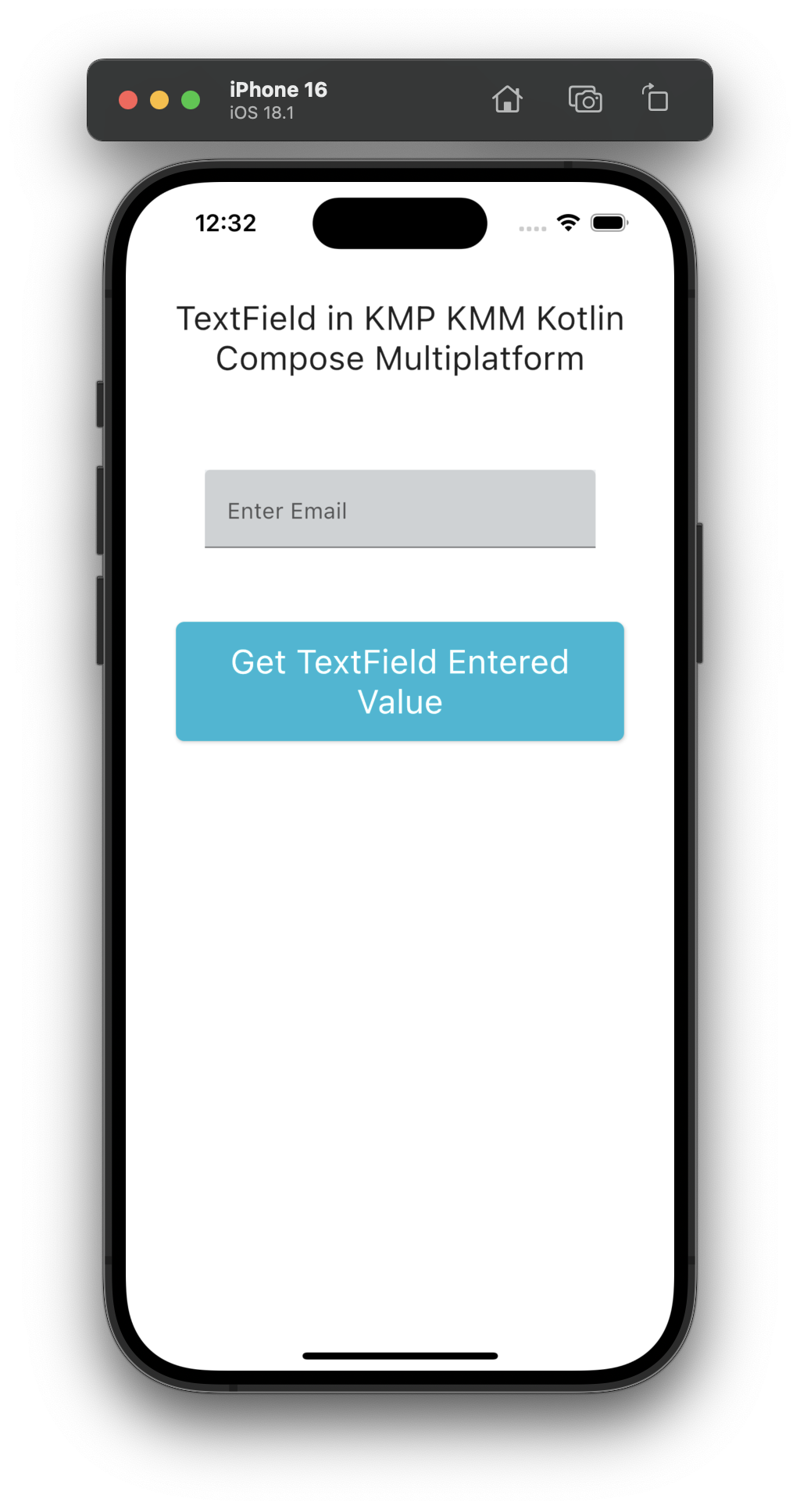
2. TextField:
The TextField component creates background color-filled Text input in Kotlin compose multiplatform.
|
1 2 3 4 5 6 |
TextField( value = textFieldDataMain, onValueChange = { textFieldDataMain = it }, label = { Text("Enter Email") }, modifier = Modifier.padding(16.dp).background(Color(0xFFECEFF1)), ) |
Note: All the definitions of properties are the same as those mentioned above. Just background is used to set the background color to TextField.
Source code:
|
1 2 3 4 5 6 7 8 9 10 11 12 13 14 15 16 17 18 19 20 21 22 23 24 25 26 27 28 29 30 31 32 33 34 35 36 37 38 39 40 41 42 43 44 45 46 47 48 49 50 51 52 53 54 55 56 57 58 59 60 61 62 63 64 65 66 67 68 69 70 71 72 73 74 75 76 77 78 79 80 81 82 83 84 85 86 87 88 89 90 91 92 93 94 95 96 97 |
package com.app.test import androidx.compose.foundation.background import androidx.compose.foundation.interaction.MutableInteractionSource import androidx.compose.foundation.layout.Arrangement import androidx.compose.foundation.layout.Box import androidx.compose.foundation.layout.Column import androidx.compose.foundation.layout.Spacer import androidx.compose.foundation.layout.fillMaxSize import androidx.compose.foundation.layout.fillMaxWidth import androidx.compose.foundation.layout.height import androidx.compose.foundation.layout.padding import androidx.compose.foundation.rememberScrollState import androidx.compose.foundation.shape.RoundedCornerShape import androidx.compose.foundation.text.BasicTextField import androidx.compose.foundation.verticalScroll import androidx.compose.material.Button import androidx.compose.material.ButtonDefaults import androidx.compose.material.MaterialTheme import androidx.compose.material.Text import androidx.compose.material.TextField import androidx.compose.runtime.* import androidx.compose.ui.Alignment import androidx.compose.ui.Modifier import androidx.compose.ui.graphics.Color import androidx.compose.ui.text.TextStyle import androidx.compose.ui.text.style.TextAlign import androidx.compose.ui.unit.dp import androidx.compose.ui.unit.sp @Composable fun App() { MaterialTheme { var textFieldDataMain by remember { mutableStateOf("") } var textFieldDataGet by remember { mutableStateOf("") } Box(modifier = Modifier.fillMaxSize()) { Column( modifier = Modifier .fillMaxSize() .verticalScroll(rememberScrollState()) .padding(24.dp), verticalArrangement = Arrangement.Top, horizontalAlignment = Alignment.CenterHorizontally, ) { Text( "TextField in KMP KMM Kotlin Compose Multiplatform", style = TextStyle(fontSize = 24.sp), textAlign = TextAlign.Center ) Spacer(Modifier.height(50.dp)) TextField( value = textFieldDataMain, onValueChange = { textFieldDataMain = it }, label = { Text("Enter Email") }, modifier = Modifier.padding(16.dp).background(Color(0xFFECEFF1)), ) Spacer(Modifier.height(25.dp)) Button( onClick = { println("TextField Entered Value = $textFieldDataGet") textFieldDataGet = textFieldDataMain; }, modifier = Modifier.padding(12.dp).fillMaxWidth(), enabled = true, interactionSource = remember { MutableInteractionSource() }, shape = RoundedCornerShape(6.dp), colors = ButtonDefaults.buttonColors( contentColor = Color.White, backgroundColor = Color(0xFF00B8D4), ) ) { Text( "Get TextField Entered Value", textAlign = TextAlign.Center, style = TextStyle(fontSize = 24.sp), modifier = Modifier.padding(6.dp) ) } Text( textFieldDataGet, textAlign = TextAlign.Center, color = Color.Black, style = TextStyle(fontSize = 24.sp), modifier = Modifier.padding(6.dp) ) } } } } |
Screenshot:
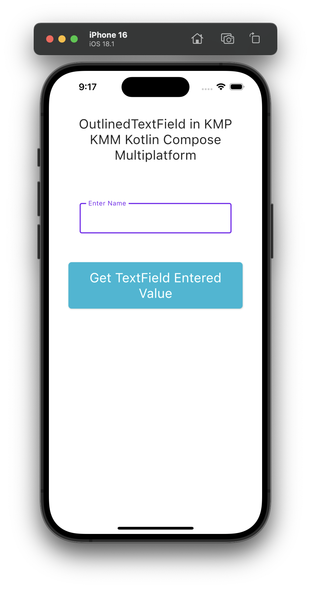
3. OutlinedTextField:
Outlined TextField is used to create bordered material style Text Field in KMP. It renders with a default border, and we can modify it further.
|
1 2 3 4 5 6 |
OutlinedTextField( value = textFieldDataMain, onValueChange = { textFieldDataMain = it }, label = { Text("Enter Name") }, modifier = Modifier.padding(16.dp) ) |
Screenshot:
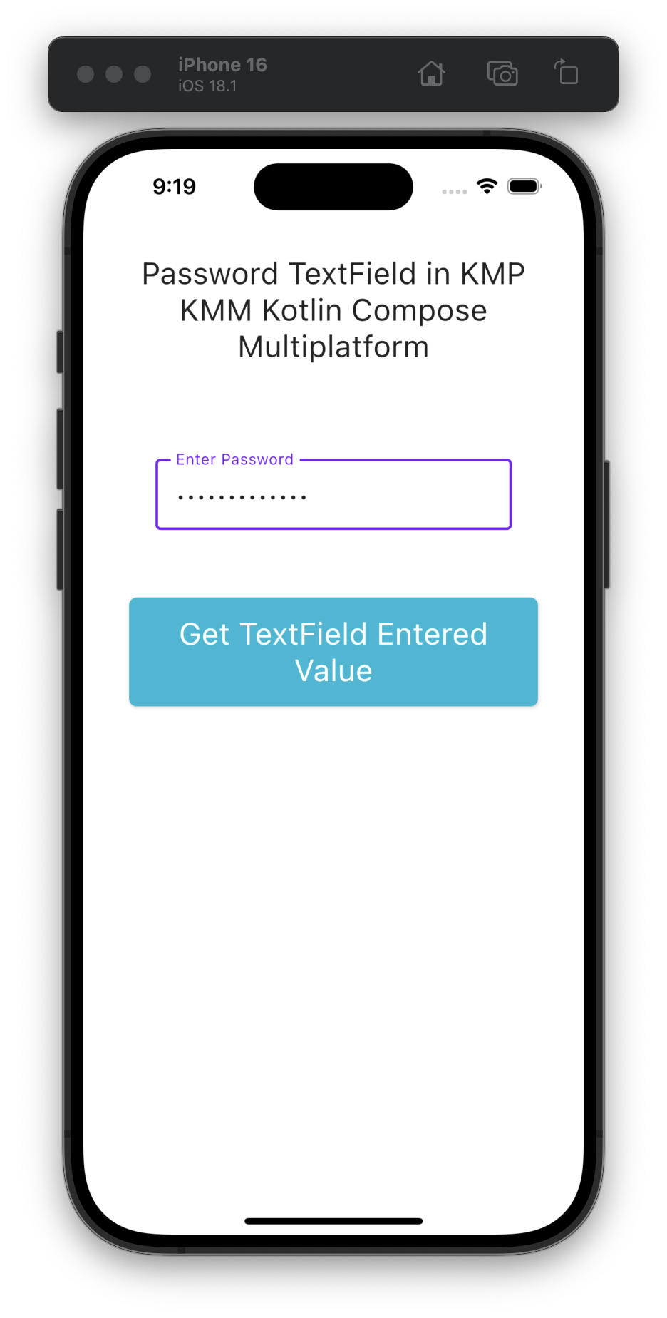
4. Password TextField:
There is a property PasswordVisualTransformation(), which hides the TextField inside the typed text and shows stars in its place.
|
1 2 3 4 5 6 7 |
OutlinedTextField( value = textFieldDataMain, onValueChange = { textFieldDataMain = it }, label = { Text("Enter Password") }, modifier = Modifier.padding(16.dp), visualTransformation = PasswordVisualTransformation(), ) |
Screenshot:
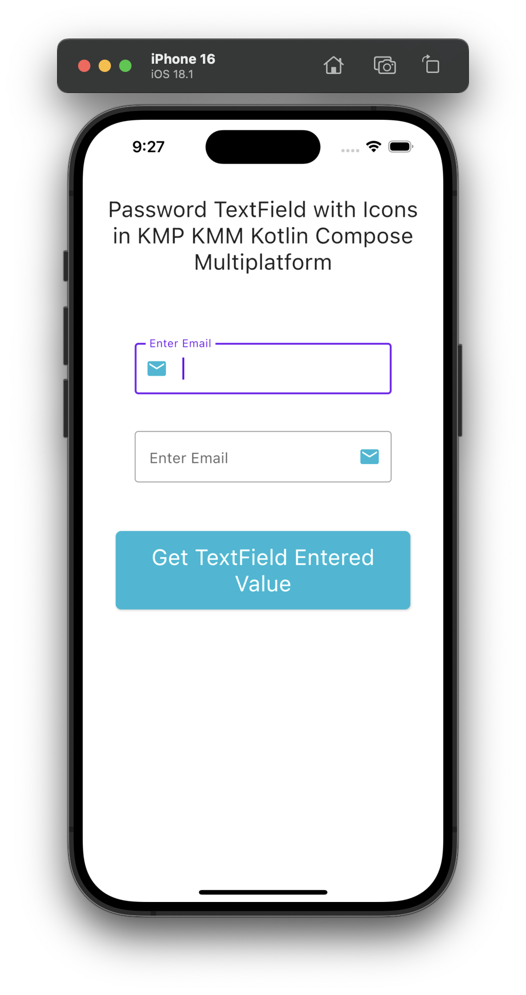
5. TextField with Icons:
In Kotlin Compose Multiplatform, we can add material vector icons in the TextField component. We can add icons at the start of TextField, called leading icons, and at the end of the TextField, called trailing icons.
|
1 2 3 4 5 6 7 8 9 10 11 12 13 14 15 |
OutlinedTextField( value = textFieldDataMain, onValueChange = { textFieldDataMain = it }, label = { Text("Enter Email") }, modifier = Modifier.padding(16.dp), leadingIcon = { Icon(Icons.Filled.Email, contentDescription = "Email Icon", tint = Color(0xFF00B8D4)) }, ) OutlinedTextField( value = textFieldDataMain, onValueChange = { textFieldDataMain = it }, label = { Text("Enter Email") }, modifier = Modifier.padding(16.dp), trailingIcon = { Icon(Icons.Filled.Email, contentDescription = "Email Icon", tint = Color(0xFF00B8D4)) }, ) |
Screenshot:
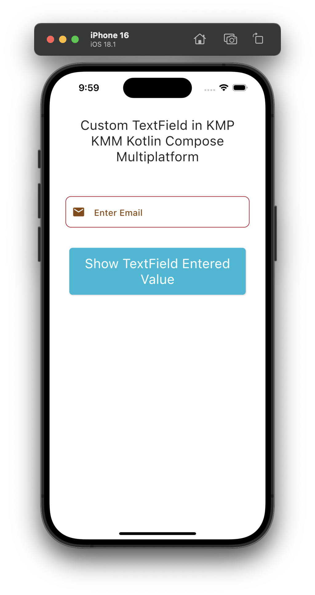
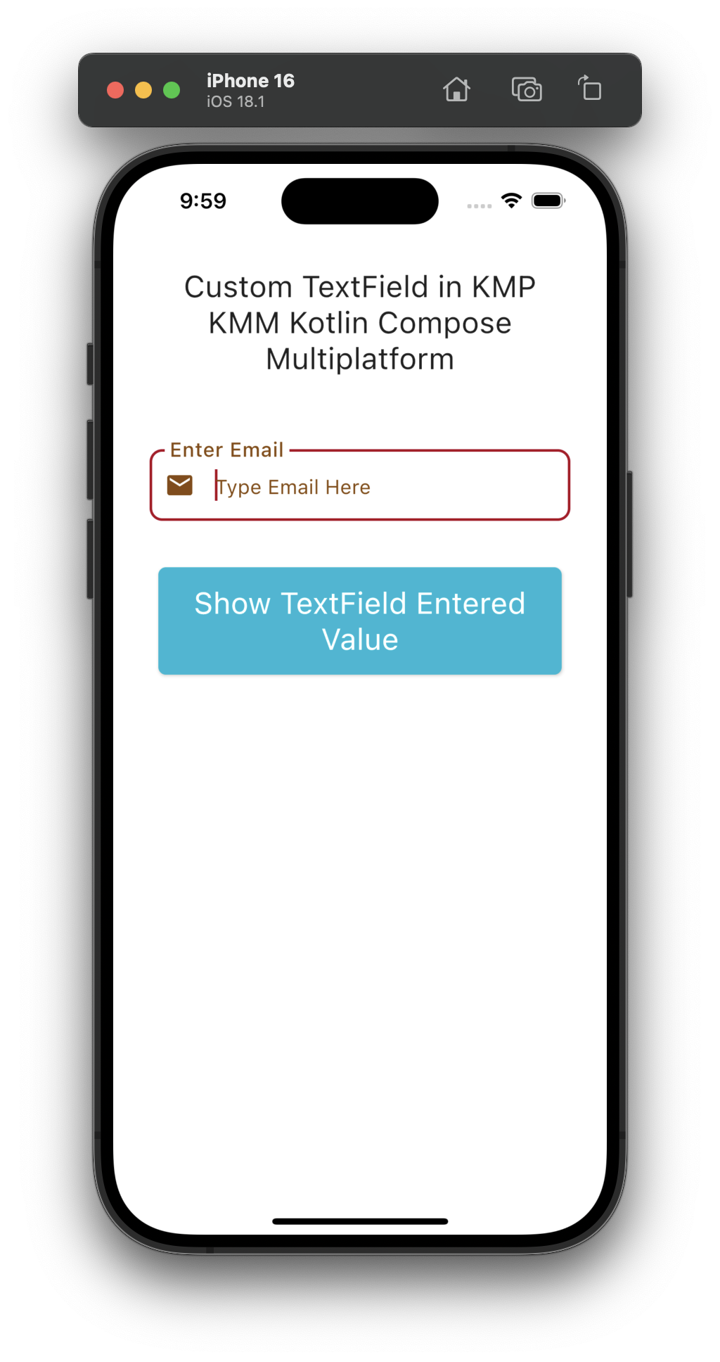
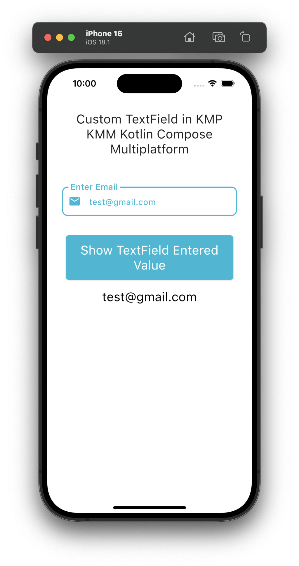
6. Custome TextField with Reusable component:
After reading all the TextField widget code, I created a custom component for TextFiled, which you can use in your projects. Bypassing the right argument, you can achieve any styling option.
Source Code:
|
1 2 3 4 5 6 7 8 9 10 11 12 13 14 15 16 17 18 19 20 21 22 23 24 25 26 27 28 29 30 31 32 33 34 35 36 37 38 39 40 41 42 43 44 45 46 47 48 49 50 51 52 53 54 55 56 57 58 59 60 61 62 63 64 65 66 67 68 69 70 71 72 73 74 75 76 77 78 |
@Composable private fun CustomTextField( value: String, onValueChange: (String) -> Unit, label: String, placeholder: String, isPassword: Boolean = false, keyboardType: KeyboardType = KeyboardType.Text, isError: Boolean = false ) { var isFocused by remember { mutableStateOf(false) } Column( verticalArrangement = Arrangement.spacedBy(8.dp), modifier = Modifier.padding(horizontal = 5.dp) ) { OutlinedTextField( label = { Text( fontWeight = FontWeight.Medium, text = label, fontSize = 16.sp, color = if (value.isEmpty()) Color(0XFF87490C) else Color(0xFF00B8D4), ) }, leadingIcon = { Icon( Icons.Filled.Email, contentDescription = "Email Icon", tint = if (isError) Color(0XFF87490C) else Color(0xFF00B8D4) ) }, /* trailingIcon = { if (isShowTrailingIcon) Icon( Icons.Filled.Person, contentDescription = "Person Icon", tint = if (isFocused) Color(0xFF00B8D4) else Color(0xFF00B8D4) ) },*/ value = value, onValueChange = { newValue -> if (isPassword) { // For password field: prevent paste and only allow numbers if (newValue.length <= value.length + 1 && newValue.all { it.isDigit() }) { onValueChange(newValue) } } else { // For non-password fields: allow any input onValueChange(newValue) } }, placeholder = { Text(placeholder, color = Color(0XFF87490C)) }, modifier = Modifier.fillMaxWidth().background( Color.White, RoundedCornerShape(3.dp) ).onFocusChanged { focusState -> isFocused = focusState.isFocused }, shape = RoundedCornerShape(10.dp), visualTransformation = if (isPassword) PasswordVisualTransformation() else VisualTransformation.None, keyboardOptions = KeyboardOptions( keyboardType = if (isPassword) KeyboardType.Number else keyboardType ), colors = TextFieldDefaults.outlinedTextFieldColors( backgroundColor = Color.Transparent, focusedBorderColor = Color(0XFF00B8D4), unfocusedBorderColor = Color(0XFF87490C), placeholderColor = Color.Gray, unfocusedLabelColor = Color(0XFF87490C), focusedLabelColor = Color(0xFF00B8D4), textColor = Color(0xFF00B8D4), cursorColor = Color(0xFF00B8D4), disabledPlaceholderColor = Color(0xFF00B8D4) ), singleLine = true, isError = isError ) } } |
Code explanation:
- isFocused State: To detect whether or not selected TextField is selected.
- label: Render the label of the TextField widget.
- leadingIcon: Show an icon at the start of TextField.
- trailingIcon: Show an icon at the end of textField.
- value: Typed value inside of a TextField.
- onValueChange: Calls every time the user types something inside a TextField.
- placeholder: Hint text.
- Modifier: To set View properties on TextField.
- RoundedCornerShape: Make the TextFiled corner border rouned.
- PasswordVisualTransformation(): Show TextFiled text as input type Password.
- backgroundColor: To set the background color of TextField.
- focusedBorderColor: This will be the border color after focusing or selecting the TextField.
- unfocusedBorderColor: After unfocusing on the TextFiled, this will be the border color.
- placeholderColor: TextField placeholder color.
- unfocusedLabelColor: After unfocusing the TextField, this would be Text color.
- focusedLabelColor: When the user focuses the TextField, this will be the focused label color.
- textColor: TextFiled inside typed text color(Text widget).
- cursorColor: TextField blinking cursor color.
- disabledPlaceholderColor: When TextField is disabled, then it is the placeholder color.
- singleLine: Make the TextField only single line enabled.
- isError: Handle errors in TextField.
Complete source code for App.kt file:
|
1 2 3 4 5 6 7 8 9 10 11 12 13 14 15 16 17 18 19 20 21 22 23 24 25 26 27 28 29 30 31 32 33 34 35 36 37 38 39 40 41 42 43 44 45 46 47 48 49 50 51 52 53 54 55 56 57 58 59 60 61 62 63 64 65 66 67 68 69 70 71 72 73 74 75 76 77 78 79 80 81 82 83 84 85 86 87 88 89 90 91 92 93 94 95 96 97 98 99 100 101 102 103 104 105 106 107 108 109 110 111 112 113 114 115 116 117 118 119 120 121 122 123 124 125 126 127 128 129 130 131 132 133 134 135 136 137 138 139 140 141 142 143 144 145 146 147 148 149 150 151 152 153 154 155 156 157 158 159 160 161 162 163 164 165 166 167 168 169 170 171 172 173 174 175 176 177 178 179 180 181 182 183 184 185 186 187 188 |
package com.app.test import androidx.compose.foundation.background import androidx.compose.foundation.interaction.MutableInteractionSource import androidx.compose.foundation.layout.Arrangement import androidx.compose.foundation.layout.Box import androidx.compose.foundation.layout.Column import androidx.compose.foundation.layout.Spacer import androidx.compose.foundation.layout.fillMaxSize import androidx.compose.foundation.layout.fillMaxWidth import androidx.compose.foundation.layout.height import androidx.compose.foundation.layout.padding import androidx.compose.foundation.rememberScrollState import androidx.compose.foundation.shape.RoundedCornerShape import androidx.compose.foundation.text.KeyboardOptions import androidx.compose.foundation.verticalScroll import androidx.compose.material.Button import androidx.compose.material.ButtonDefaults import androidx.compose.material.Icon import androidx.compose.material.MaterialTheme import androidx.compose.material.OutlinedTextField import androidx.compose.material.Text import androidx.compose.material.TextFieldDefaults import androidx.compose.material.icons.Icons import androidx.compose.material.icons.filled.Email import androidx.compose.material.icons.filled.Person import androidx.compose.runtime.* import androidx.compose.ui.Alignment import androidx.compose.ui.Modifier import androidx.compose.ui.focus.onFocusChanged import androidx.compose.ui.graphics.Color import androidx.compose.ui.text.TextStyle import androidx.compose.ui.text.font.FontWeight import androidx.compose.ui.text.input.KeyboardType import androidx.compose.ui.text.input.PasswordVisualTransformation import androidx.compose.ui.text.input.VisualTransformation import androidx.compose.ui.text.style.TextAlign import androidx.compose.ui.unit.dp import androidx.compose.ui.unit.sp @Composable fun App() { MaterialTheme { var textFieldData by remember { mutableStateOf("") } var textFieldData2 by remember { mutableStateOf("") } Box(modifier = Modifier.fillMaxSize()) { Column( modifier = Modifier .fillMaxSize() .verticalScroll(rememberScrollState()) .padding(24.dp), verticalArrangement = Arrangement.Top, horizontalAlignment = Alignment.CenterHorizontally, ) { Text( "Custom TextField in KMP KMM Kotlin Compose Multiplatform", style = TextStyle(fontSize = 24.sp), textAlign = TextAlign.Center ) Spacer(Modifier.height(50.dp)) CustomTextField( value = textFieldData, onValueChange = { textFieldData = it }, label = "Enter Email", placeholder = "Type Email Here", isError = textFieldData.isEmpty() ) Spacer(Modifier.height(25.dp)) Button( onClick = { println("TextField Entered Value = $textFieldData") textFieldData2 = textFieldData; }, modifier = Modifier.padding(12.dp).fillMaxWidth(), enabled = true, interactionSource = remember { MutableInteractionSource() }, shape = RoundedCornerShape(6.dp), colors = ButtonDefaults.buttonColors( contentColor = Color.White, backgroundColor = Color(0xFF00B8D4), ) ) { Text( "Show TextField Entered Value", textAlign = TextAlign.Center, style = TextStyle(fontSize = 24.sp), modifier = Modifier.padding(6.dp) ) } Text( textFieldData2, textAlign = TextAlign.Center, color = Color.Black, style = TextStyle(fontSize = 24.sp), modifier = Modifier.padding(6.dp) ) } } } } @Composable private fun CustomTextField( value: String, onValueChange: (String) -> Unit, label: String, placeholder: String, isPassword: Boolean = false, keyboardType: KeyboardType = KeyboardType.Text, isError: Boolean = false ) { var isFocused by remember { mutableStateOf(false) } Column( verticalArrangement = Arrangement.spacedBy(8.dp), modifier = Modifier.padding(horizontal = 5.dp) ) { OutlinedTextField( label = { Text( fontWeight = FontWeight.Medium, text = label, fontSize = 16.sp, color = if (value.isEmpty()) Color(0XFF87490C) else Color(0xFF00B8D4), ) }, leadingIcon = { Icon( Icons.Filled.Email, contentDescription = "Email Icon", tint = if (isError) Color(0XFF87490C) else Color(0xFF00B8D4) ) }, /* trailingIcon = { if (isShowTrailingIcon) Icon( Icons.Filled.Person, contentDescription = "Person Icon", tint = if (isFocused) Color(0xFF00B8D4) else Color(0xFF00B8D4) ) },*/ value = value, onValueChange = { newValue -> if (isPassword) { // For password field: prevent paste and only allow numbers if (newValue.length <= value.length + 1 && newValue.all { it.isDigit() }) { onValueChange(newValue) } } else { // For non-password fields: allow any input onValueChange(newValue) } }, placeholder = { Text(placeholder, color = Color(0XFF87490C)) }, modifier = Modifier.fillMaxWidth().background( Color.White, RoundedCornerShape(3.dp) ).onFocusChanged { focusState -> isFocused = focusState.isFocused }, shape = RoundedCornerShape(10.dp), visualTransformation = if (isPassword) PasswordVisualTransformation() else VisualTransformation.None, keyboardOptions = KeyboardOptions( keyboardType = if (isPassword) KeyboardType.Number else keyboardType ), colors = TextFieldDefaults.outlinedTextFieldColors( backgroundColor = Color.Transparent, focusedBorderColor = Color(0XFF00B8D4), unfocusedBorderColor = Color(0XFF87490C), placeholderColor = Color.Gray, unfocusedLabelColor = Color(0XFF87490C), focusedLabelColor = Color(0xFF00B8D4), textColor = Color(0xFF00B8D4), cursorColor = Color(0xFF00B8D4), disabledPlaceholderColor = Color(0xFF00B8D4) ), singleLine = true, isError = isError ) } } |
Output: