In today’s tutorial, we will learn about Slider in KMP KMM Kotlin Compose Multiplatform for both Android & iOS platforms. We will learn about the Basic and range slider and their properties for customizing the slider view.
Slider in KMP KMM Compose Multiplatform Tutorial:
In Kotlin, Compose multiplatform, the Slider component allows us to select a value from a defined range by dragging a handle present on a slide. The purpose of the slider is to give the user control over settings like volume control, music video backwards and forward functionality, set device brightness and selecting a specific value within a given range.
Creating Slider in KMP(KMM):
In Kotlin Compose multiplatform, we have to define the Slider component.
|
1 2 3 4 5 6 7 8 9 10 11 |
var sliderPosition by remember { mutableStateOf(0f) } Slider( value = sliderPosition, onValueChange = { sliderPosition = it }, ) Text( text = sliderPosition.toString(), style = MaterialTheme.typography.h6 ) |
Code explanation:
- sliderPosition: This state holds the slider value by default in Float.
- value: To set default slider value.
- onValueChange: Calls every time the user drags the slider and updates the value into the slider position state.
Complete code:
|
1 2 3 4 5 6 7 8 9 10 11 12 13 14 15 16 17 18 19 20 21 22 23 24 25 26 27 28 29 30 31 32 33 34 35 36 37 38 39 40 41 42 43 44 45 46 |
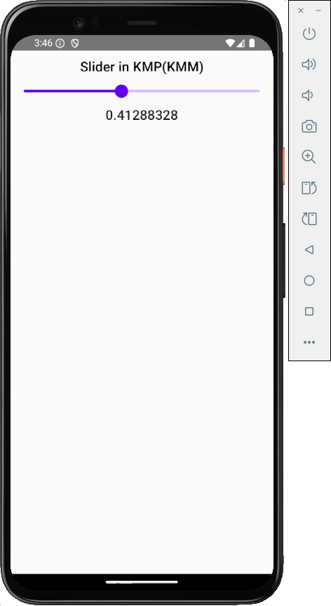
package com.app.test import androidx.compose.foundation.layout.Arrangement import androidx.compose.foundation.layout.Column import androidx.compose.foundation.layout.fillMaxWidth import androidx.compose.foundation.layout.padding import androidx.compose.material.ExperimentalMaterialApi import androidx.compose.material.MaterialTheme import androidx.compose.material.Slider import androidx.compose.material.Text import androidx.compose.runtime.* import androidx.compose.ui.Alignment import androidx.compose.ui.Modifier import androidx.compose.ui.graphics.Color import androidx.compose.ui.text.style.TextAlign import androidx.compose.ui.unit.dp @Composable fun App() { MaterialTheme { var sliderPosition by remember { mutableStateOf(0f) } Column( modifier = Modifier.padding(12.dp).fillMaxWidth(), verticalArrangement = Arrangement.Top, horizontalAlignment = Alignment.CenterHorizontally ) { Text( text = "Slider in KMP(KMM)", style = MaterialTheme.typography.h6, color = Color.Black, textAlign = TextAlign.Center ) Slider( value = sliderPosition, onValueChange = { sliderPosition = it }, ) Text( text = sliderPosition.toString(), style = MaterialTheme.typography.h6 ) } } } |
Screenshot:
Set Slider values within a Range:
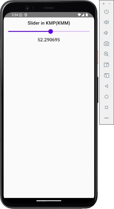
We must use the valueRange property to set the Slider value within a defined range.
- valueRange = 0f..100f: In this example, we set the slider value range from 0 to 100 in Float type.
|
1 2 3 4 5 |
Slider( value = sliderPosition, onValueChange = { sliderPosition = it }, valueRange = 0f..100f ) |
Screenshot:
Get Slider value without decimal points in Integer type:
By default, the slider works only with floating values. However, to display its values without decimal points, we must explicitly convert the float values into integers. We will use the toInt() method.
|
1 2 3 4 5 6 7 8 9 10 11 12 13 14 |
var sliderPosition by remember { mutableStateOf(0.toFloat()) } Slider( value = sliderPosition, onValueChange = { sliderPosition = it }, valueRange = 0.toFloat()..100.toFloat() ) Text( text = sliderPosition.toInt().toString(), style = MaterialTheme.typography.h6 ) |
Screenshot:
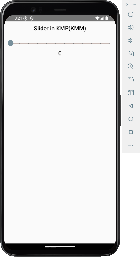
Create Slider with Steps:
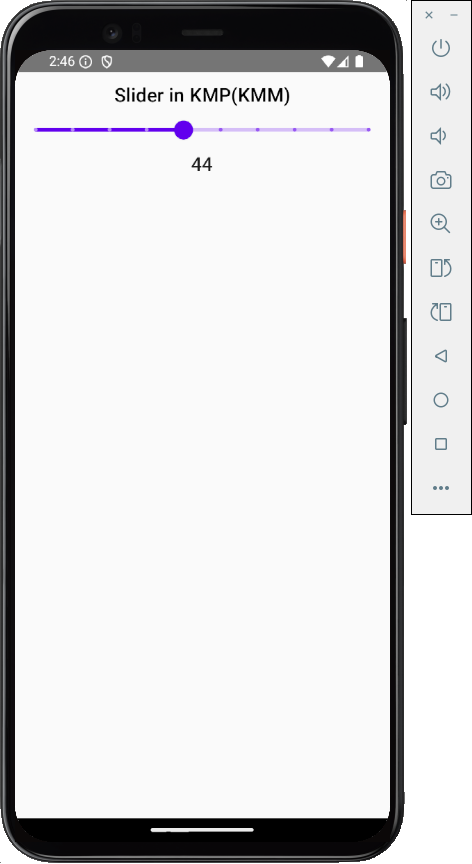
By default, when we create a slider component, it moves freely to any position. We can also divide the slider into multiple steps. So, it always moves to the step based on the middle drag location. The steps property is used to create multiple steps in Slider.
|
1 2 3 4 5 6 7 8 9 10 11 12 |
var sliderPosition by remember { mutableStateOf(0.toFloat()) } Slider( value = sliderPosition, onValueChange = { sliderPosition = it }, valueRange = 0.toFloat()..100.toFloat(), steps = 8 ) Text( text = sliderPosition.toInt().toString(), style = MaterialTheme.typography.h6 ) |
Screenshot:
Customize Slider Thumb, Track colors:
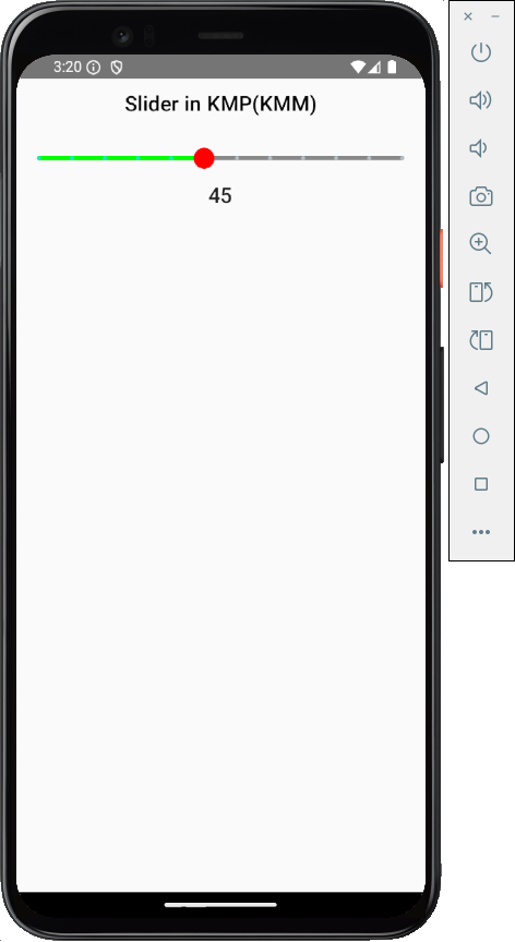
The SliderDefaults.colors() property is used to set all colors in the Slider component. It has multiple sub-properties.
- thumbColor: Slider thumb colour when the slider is enabled.
- activeTrackColor: The color of the track part, which is active, means the thumb is ahead of that part.
- inactiveTrackColor: The color of the track part, which is inactive, means the thumb is before that part.
- inactiveTickColor: The color used to draw tick marks on the inactive track.
- disabledThumbColor: Thumb color when Slider is disabled.
- activeTickColor: The colour used to draw a tick mark on an active track.
- disabledActiveTrackColor: Color of the active part of the track when Slider is disabled.
- disabledActiveTickColor: Color draw on the tick mark in the active track when Slider is disabled.
- disabledInactiveTickColor: Color draw on the tick mark on the inactive part of the track when the slider is disabled.
- disabledInactiveTrackColor: Color of the track in active part when Slider is disabled.
|
1 2 3 4 5 6 7 8 9 10 11 12 13 14 15 16 17 18 19 20 21 22 23 24 |
var sliderPosition by remember { mutableStateOf(0.toFloat()) } Slider( value = sliderPosition, onValueChange = { sliderPosition = it }, colors = SliderDefaults.colors( thumbColor = Color.Red, activeTrackColor = Color.Green, inactiveTrackColor = Color.Gray, inactiveTickColor = Color(0xffB0BEC5), disabledThumbColor = Color(0xff78909C), activeTickColor = Color(0xff1DE9B6), disabledActiveTrackColor = Color(0xffBDBDBD), disabledActiveTickColor = Color(0xff757575), disabledInactiveTickColor = Color(0xff616161), disabledInactiveTrackColor = Color(0xffBCAAA4) ), steps = 10, valueRange = 0.toFloat()..100.toFloat(), ) Text( text = sliderPosition.toInt().toString(), style = MaterialTheme.typography.h6 ) |
Screenshot:
Disabled Slider:
To disable the slider component in KMP KMM Compose Multiplatform. We will use its property enabled.
- enabled = false: Disable the Slider component.
|
1 2 3 4 5 6 7 8 9 10 11 12 13 14 15 16 17 18 19 |
Slider( value = sliderPosition, onValueChange = { sliderPosition = it }, enabled = false, colors = SliderDefaults.colors( thumbColor = Color.Red, activeTrackColor = Color.Green, inactiveTrackColor = Color.Gray, inactiveTickColor = Color(0xffB0BEC5), disabledThumbColor = Color(0xff78909C), activeTickColor = Color(0xff1DE9B6), disabledActiveTrackColor = Color(0xffBDBDBD), disabledActiveTickColor = Color(0xff757575), disabledInactiveTickColor = Color(0xff616161), disabledInactiveTrackColor = Color(0xffBCAAA4) ), steps = 10, valueRange = 0.toFloat()..100.toFloat(), ) |
Screenshot:
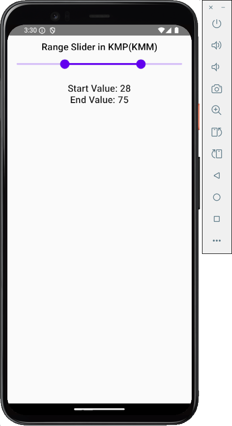
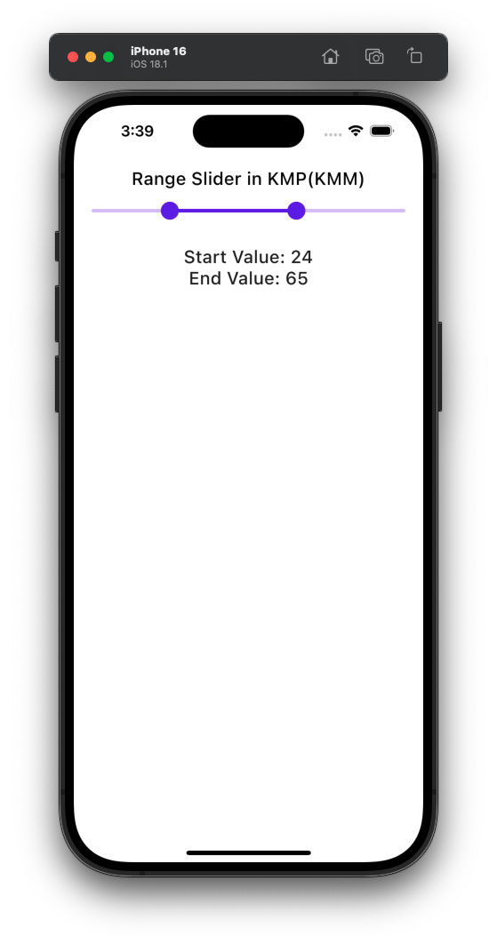
RangeSlider in KMP KMM:
By default, the Slider widget has only 1 thumb drag option, and we can only get a single output from him. However, the RangeSlider component allows us to select 2 values, Starting and Ending, separately. You have seen this type of Slider in E-Commerce applications where you set the minimum and maximum price.
|
1 2 3 4 5 6 7 8 9 10 11 12 13 14 15 16 17 18 |
var sliderPosition by remember { mutableStateOf(0f..100f) } RangeSlider( value = sliderPosition, onValueChange = { range -> sliderPosition = range }, valueRange = 0f..100f, onValueChangeFinished = {} ) Text( text = "Start Value: ${sliderPosition.start.toInt()}", style = MaterialTheme.typography.h6 ) Text( text = "End Value: ${sliderPosition.endInclusive.toInt()}", style = MaterialTheme.typography.h6 ) |
Output:
Complete source code:
|
1 2 3 4 5 6 7 8 9 10 11 12 13 14 15 16 17 18 19 20 21 22 23 24 25 26 27 28 29 30 31 32 33 34 35 36 37 38 39 40 41 42 43 44 45 46 47 48 49 50 51 52 53 54 55 56 57 58 59 60 61 |
package com.app.test import androidx.compose.foundation.layout.Arrangement import androidx.compose.foundation.layout.Column import androidx.compose.foundation.layout.Spacer import androidx.compose.foundation.layout.fillMaxWidth import androidx.compose.foundation.layout.height import androidx.compose.foundation.layout.padding import androidx.compose.material.ExperimentalMaterialApi import androidx.compose.material.MaterialTheme import androidx.compose.material.RangeSlider import androidx.compose.material.Text import androidx.compose.runtime.* import androidx.compose.ui.Alignment import androidx.compose.ui.Modifier import androidx.compose.ui.graphics.Color import androidx.compose.ui.text.style.TextAlign import androidx.compose.ui.unit.dp @OptIn(ExperimentalMaterialApi::class) @Composable fun App() { MaterialTheme { var sliderPosition by remember { mutableStateOf(0f..100f) } Column( modifier = Modifier .padding(12.dp) .fillMaxWidth(), verticalArrangement = Arrangement.Top, horizontalAlignment = Alignment.CenterHorizontally ) { Text( text = "Range Slider in KMP(KMM)", style = MaterialTheme.typography.h6, color = Color.Black, textAlign = TextAlign.Center ) RangeSlider( value = sliderPosition, onValueChange = { range -> sliderPosition = range }, valueRange = 0f..100f, onValueChangeFinished = {} ) Spacer(modifier = Modifier.height(16.dp)) Text( text = "Start Value: ${sliderPosition.start.toInt()}", style = MaterialTheme.typography.h6 ) Text( text = "End Value: ${sliderPosition.endInclusive.toInt()}", style = MaterialTheme.typography.h6 ) } } } |
Screenshot in iOS device:





I want to use the slider with modifiers of thumbTrackGapSize, trackInsideCornerSize, drawStopIndicator and drawTick. How can I access those in KMP?
The Slider component doesn’t directly expose parameters like thumbTrackGapSize, trackInsideCornerSize, drawStopIndicator, or drawTick in its standard Material library.