In today’s tutorial, we learn how to set the background image in the KMP Compose Multiplatform Android iOS application. This is a step-by-step guide in which we will use background images from shared resources.
Set Background Image in KMP Compose Multiplatform App Screen.
We all have seen background images applied in many Android & iOS applications. In KMM(Kotlin multiplatform mobile) to set the background image as the application screen background we will use the Box widget. Basically in Compose Multiplatform, all the Views are in Root and child format.
1. First of all download our demo home_bg.jpg image from below or you can use your image. But the image should be in the right dimensions.
2. Open your Compose Multiplatform project and paste the background image into,
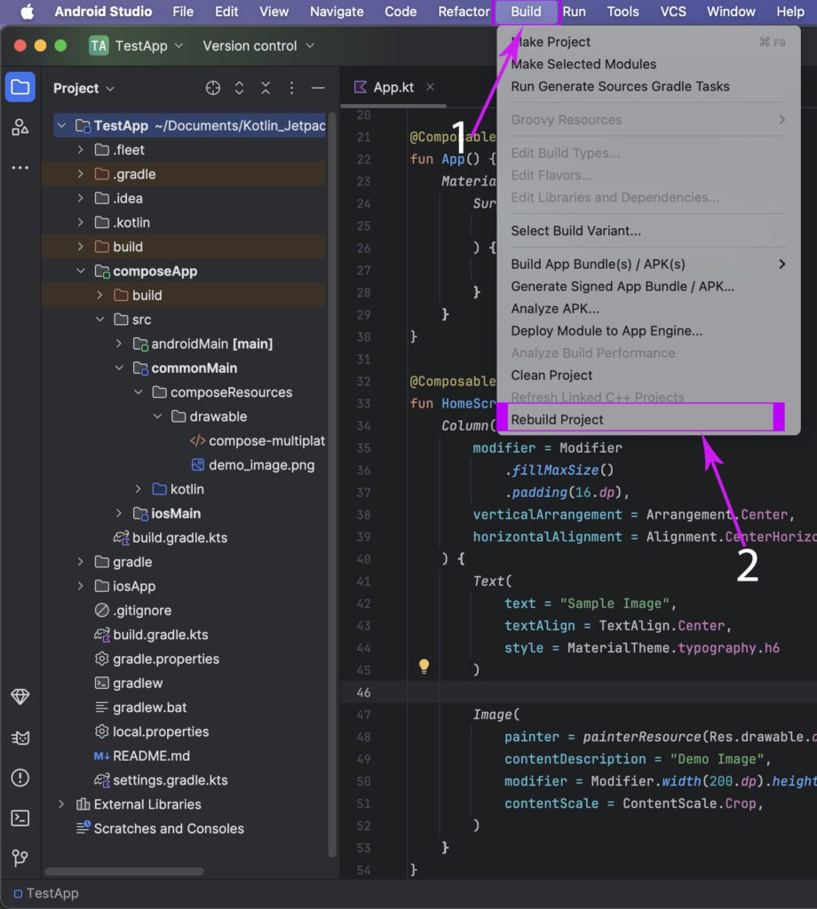
composeApp -> commonMain -> composeResource -> drawable folder.
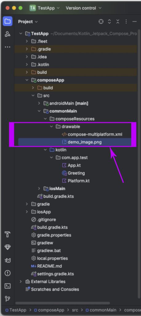
3. Now, we have to Rebuild our Android Studio project. Without the Rebuild project, we cannot use images placed inside shared resources.
4. Open your project’s App.kt file and create your app’s Root component – App composable.
|
1 2 3 4 5 6 7 8 9 10 |
@Composable fun App() { MaterialTheme { Surface( modifier = Modifier.fillMaxSize(), ) { HomeScreen() } } } |
5. Creating a HomeScreen composable component. This is our home screen. In this screen, we will integrate the Box component, and as a box child, we will put the Image component. This will set the background image as our Home screen.
|
1 2 3 4 5 6 7 8 9 10 11 12 13 14 15 16 17 18 19 20 21 22 23 24 25 26 27 28 29 30 |
@Composable fun HomeScreen() { Box( modifier = Modifier.fillMaxSize() ) { // Background image Image( painter = painterResource(Res.drawable.home_bg), contentDescription = "Background Image", modifier = Modifier.fillMaxSize(), contentScale = ContentScale.Crop ) Column( modifier = Modifier .fillMaxSize() .padding(16.dp), verticalArrangement = Arrangement.Center, horizontalAlignment = Alignment.CenterHorizontally ) { Text( text = "App with Background Image", textAlign = TextAlign.Center, style = MaterialTheme.typography.h6, color = Color.White ) } } } |
Complete source code for App.kt file:
|
1 2 3 4 5 6 7 8 9 10 11 12 13 14 15 16 17 18 19 20 21 22 23 24 25 26 27 28 29 30 31 32 33 34 35 36 37 38 39 40 41 42 43 44 45 46 47 48 49 50 51 52 53 54 55 56 57 58 59 60 61 |
package com.app.test import androidx.compose.foundation.Image import androidx.compose.foundation.layout.Arrangement import androidx.compose.foundation.layout.Box import androidx.compose.foundation.layout.Column import androidx.compose.foundation.layout.fillMaxSize import androidx.compose.foundation.layout.padding import androidx.compose.material.* import androidx.compose.runtime.* import androidx.compose.ui.Alignment import androidx.compose.ui.Modifier import androidx.compose.ui.graphics.Color import androidx.compose.ui.layout.ContentScale import androidx.compose.ui.text.style.TextAlign import androidx.compose.ui.unit.dp import org.jetbrains.compose.resources.painterResource import testapp.composeapp.generated.resources.Res import testapp.composeapp.generated.resources.home_bg @Composable fun App() { MaterialTheme { Surface( modifier = Modifier.fillMaxSize(), ) { HomeScreen() } } } @Composable fun HomeScreen() { Box( modifier = Modifier.fillMaxSize() ) { // Background image Image( painter = painterResource(Res.drawable.home_bg), contentDescription = "Background Image", modifier = Modifier.fillMaxSize(), contentScale = ContentScale.Crop ) Column( modifier = Modifier .fillMaxSize() .padding(16.dp), verticalArrangement = Arrangement.Center, horizontalAlignment = Alignment.CenterHorizontally ) { Text( text = "App with Background Image", textAlign = TextAlign.Center, style = MaterialTheme.typography.h6, color = Color.White ) } } } |
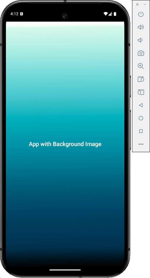
Screenshot in Android device:
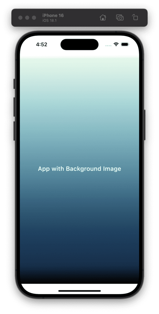
Screenshot in iOS device:
