In today’s tutorial, we will learn how to implement progress indicators in Kotlin Compose Multiplatform for both Android & iOS platforms. We will be exploring LinearProgressIndicator and CircularProgressIndicator with all their properties. We will also learn about showing and hiding the progress indicator on button click using State.
Progress Indicators in Kotlin Compose Multiplatform (KMP, KMM)
Progress indicators are essential UI components to show the app users that a background task is running. In Kotlin Compose Multiplatform, two types of progress indicators are available: LinearProgressIndicator and CircularProgressIndicator.
CircularProgressIndicator in KMP KMM:
The circular progress indicator is a circular-shaped material-style progress indicator. We have all seen this indicator in many mobile applications.
|
1 2 3 |
CircularProgressIndicator( modifier = Modifier.width(38.dp), ) |
Code explanation:
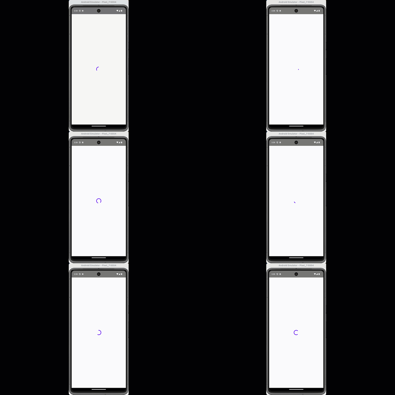
- modifier: To set Circular progress indicator Size.
Screenshot:
Properties of CircularProgressIndicator to customize:
- Modifier.width(50.dp): To set the custom size of CircularProgressIndicator.
- color: To set the Color of the progress indicator. In which colour is the progress indicator animation performs.
- backgroundColour: To set the background colour of CircularProgressIndicator.
- strokeWidth: T0 sets the thickness of the CircularProgressIndicator animation bar.
- strokeCap: To set the effect of how a CircularProgressIndicator single animation cycle will end in a specific shape.
- progress: To set the progress in CircularProgressIndicator. It supports float values, and the supported values range from 0.0 to 1.0. It creates a dynamic progress indicator where you want to show progress depending on API or User responses.
strokeCap Supported values:
- strokeCap = StrokeCap.Butt
- strokeCap = StrokeCap.Square
- strokeCap = StrokeCap.Round
Code:
|
1 2 3 4 5 6 7 8 |
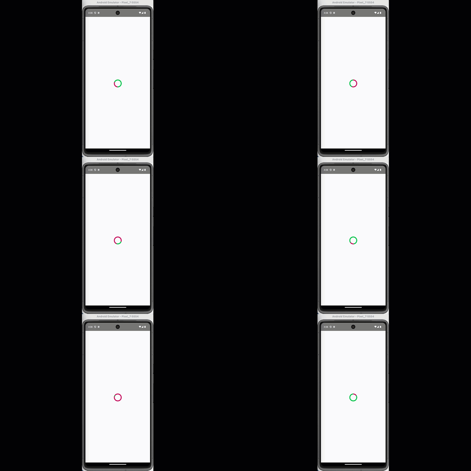
CircularProgressIndicator( modifier = Modifier.width(50.dp), color = Color(0xff00C853), backgroundColor = Color(0xffC51162), strokeWidth = 6.dp, strokeCap = StrokeCap.Square, //progress = 0.5f ) |
Screenshot:
How to Show and hide the CircularProgressIndicator on button click:
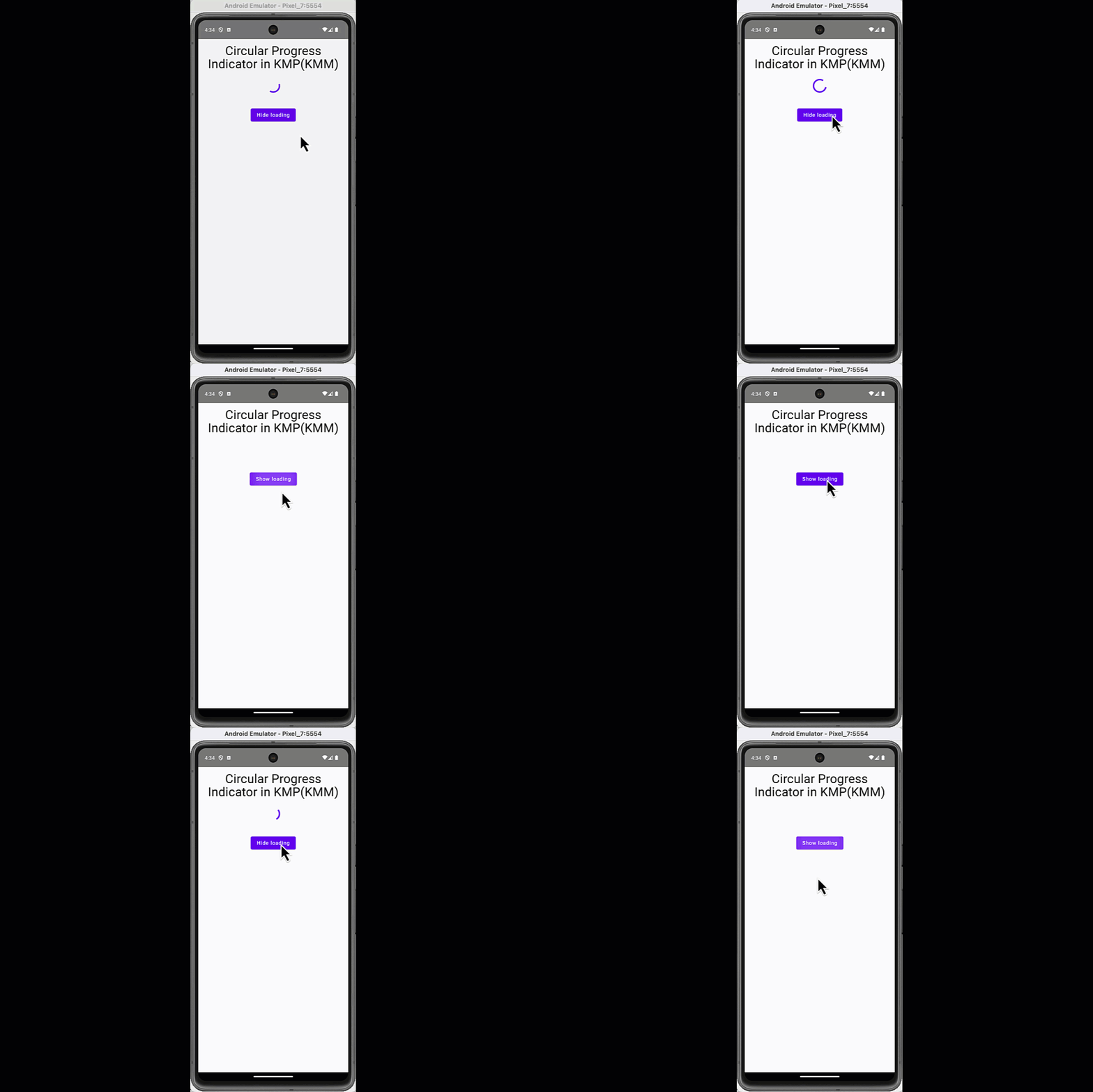
We have to use State in our application to show and hide the progress indicator on certain events. In this example, we have a button, and on button click, it first shows the CircularProgressIndicator, and then on button click again hides the progress indicator.
|
1 2 3 4 5 6 7 8 9 10 11 12 13 14 15 16 17 18 19 20 21 22 23 24 25 26 27 28 29 30 31 32 33 34 35 36 37 38 39 40 41 42 43 44 45 46 47 48 49 50 51 52 53 54 55 56 57 |
package com.app.test import androidx.compose.foundation.layout.* import androidx.compose.material.* import androidx.compose.runtime.* import androidx.compose.ui.Alignment import androidx.compose.ui.Modifier import androidx.compose.ui.graphics.Color import androidx.compose.ui.text.style.TextAlign import androidx.compose.ui.unit.dp @Composable fun App() { MaterialTheme { var loading by remember { mutableStateOf(true) } Column( modifier = Modifier .padding(12.dp) .fillMaxWidth(), verticalArrangement = Arrangement.Top, horizontalAlignment = Alignment.CenterHorizontally ) { Text( text = "Circular Progress Indicator in KMP(KMM)", style = MaterialTheme.typography.h4, color = Color.Black, textAlign = TextAlign.Center ) Spacer(modifier = Modifier.height(16.dp)) Box( modifier = Modifier .height(50.dp), contentAlignment = Alignment.Center ) { if (loading) { CircularProgressIndicator( modifier = Modifier.width(38.dp), //color = MaterialTheme.colors.primary ) } } Spacer(modifier = Modifier.height(30.dp)) Button( onClick = { loading = !loading } ) { Text(if (loading) "Hide loading" else "Show loading") } } } } |
Code explanation:
- loading: Is the boolean type mutable state.
- Box: We are wrapping the CircularProgressIndicator inside the Box component so that it does not leave the empty area when it hides. This could cause the bottom components to move up.
- if (loading) { } : In Kotlin Compose Multiplatform, we can use the If condition to replace the ternary operator. So when the loading value is true, it shows the progress indicator; when false, it does not render it.
Live screenshot:
Increase the progress of CircularProgressIndicator on Button Click:
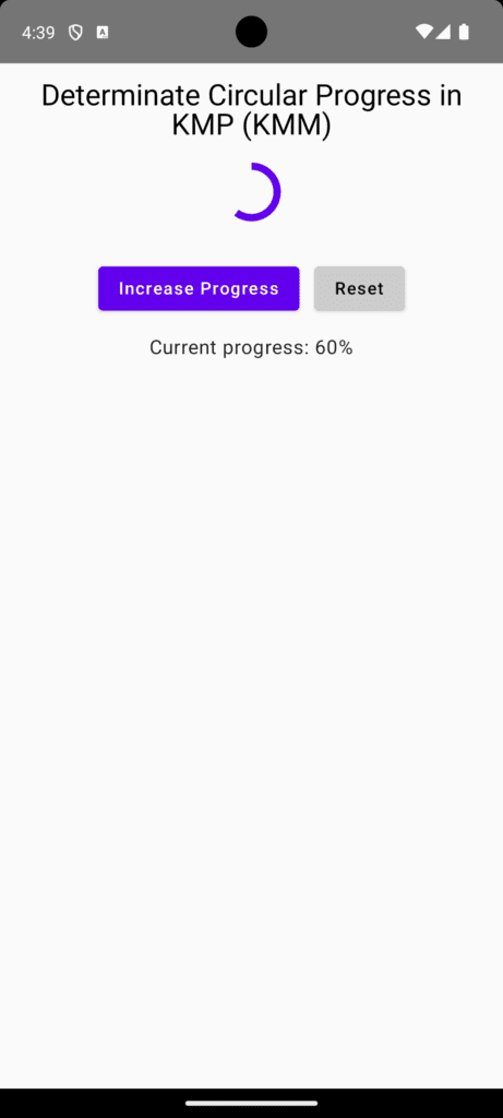
The CircularProgressIndicator has a property progress which supports values from 0.0 to 1.0. In this example, we create a State Whose value increases to +0.1 every time the user clicks the button. We have also created a button to reset the State value.
|
1 2 3 4 5 6 7 8 9 10 11 12 13 14 15 16 17 18 19 20 21 22 23 24 25 26 27 28 29 30 31 32 33 34 35 36 37 38 39 40 41 42 43 44 45 46 47 48 49 50 51 52 53 54 55 56 57 58 59 60 61 62 63 64 65 66 67 68 69 70 71 72 73 74 75 76 77 78 |
package com.app.test import androidx.compose.foundation.layout.* import androidx.compose.material.* import androidx.compose.runtime.* import androidx.compose.ui.Alignment import androidx.compose.ui.Modifier import androidx.compose.ui.graphics.Color import androidx.compose.ui.text.style.TextAlign import androidx.compose.ui.unit.dp @Composable fun App() { MaterialTheme { var progress by remember { mutableStateOf(0f) } Column( modifier = Modifier .padding(12.dp) .fillMaxWidth(), verticalArrangement = Arrangement.Top, horizontalAlignment = Alignment.CenterHorizontally ) { Text( text = "Determinate Circular Progress in KMP (KMM)", style = MaterialTheme.typography.h5, color = Color.Black, textAlign = TextAlign.Center ) Spacer(modifier = Modifier.height(16.dp)) Box( modifier = Modifier .height(50.dp), contentAlignment = Alignment.Center ) { CircularProgressIndicator( progress = progress.coerceIn(0f, 1f), modifier = Modifier.size(48.dp), strokeWidth = 6.dp ) } Spacer(modifier = Modifier.height(30.dp)) Row( horizontalArrangement = Arrangement.spacedBy(12.dp), verticalAlignment = Alignment.CenterVertically ) { Button( onClick = { if (progress < 1.0f) { progress += 0.1f } }, enabled = progress < 1.0f ) { Text("Increase Progress") } Button( onClick = { progress = 0f }, colors = ButtonDefaults.buttonColors(backgroundColor = Color.LightGray) ) { Text("Reset") } } Spacer(modifier = Modifier.height(12.dp)) Text( text = "Current progress: ${(progress * 100).toInt()}%", style = MaterialTheme.typography.body1 ) } } } |
Screenshot:
LinearProgressIndicator in KMP KMM:
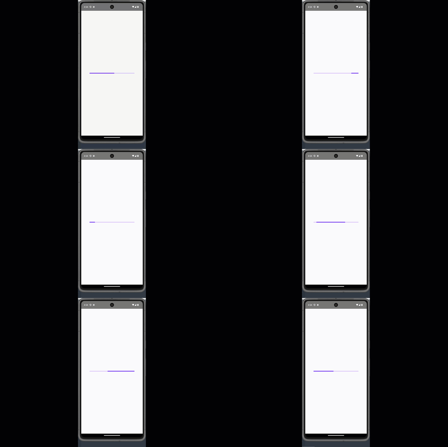
The LinearProgressIndicator is a horizontally shaped progress indicator in Kotlin Compose Multiplatform. The animation starts from the left side and goes to the right side. Moving on to a background.
|
1 2 3 |
LinearProgressIndicator( modifier = Modifier.width(300.dp), ) |
Screenshot:
Custom LinearProgressIndicator:
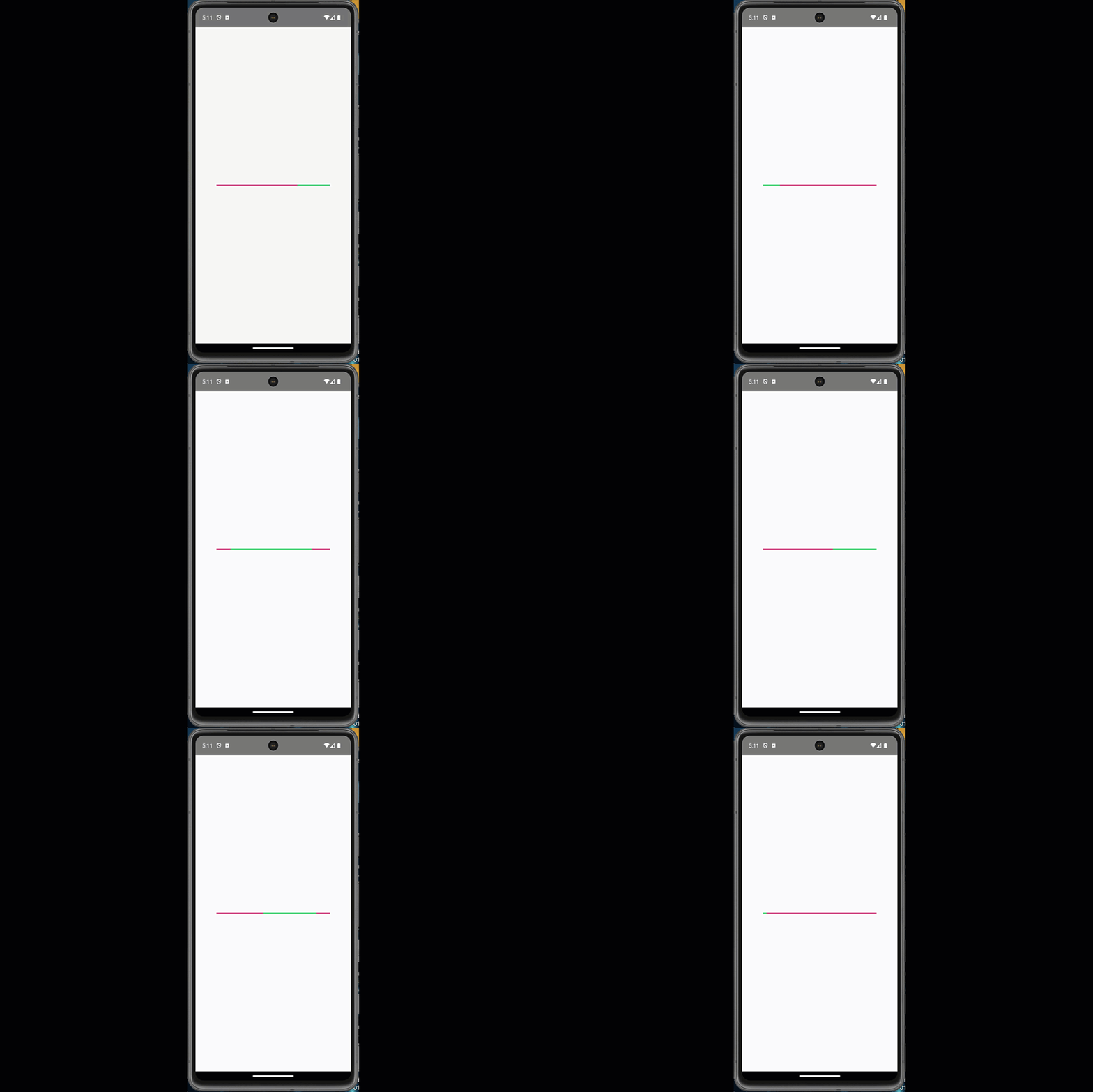
To modify and customize the LinearProgressIndicator, we must use the same properties as the CircularProgressIndicator.
|
1 2 3 4 5 6 7 8 |
LinearProgressIndicator( modifier = Modifier.width(300.dp), color = Color(0xff00C853), backgroundColor = Color(0xffC51162), strokeCap = StrokeCap.Square, //progress = 0.5f ), ) |
Code explanation:
- Modifier.width(300.dp): To set the custom width of LinearProgressIndicator.
- color: To set the color of LinearProgressIndicator.
- backgroundColor: To set the background colour of LinearProgressIndicator.
- strokeCap: To set how the LinearProgressIndicator animation ends.
Screenshot:
Creating Custom Golden Shimmer Gradient ProgressBar in KMP KMM:
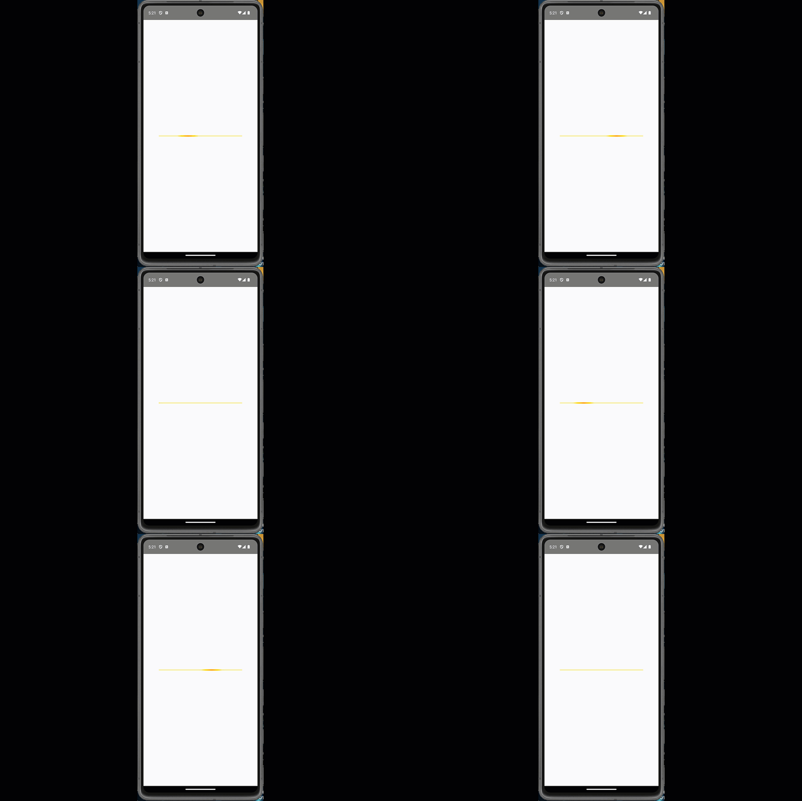
In Kotlin Compose Multiplatform, we can create the custom gradient effect Linear Progress Bar. It has a moving gradient effect inside it.
|
1 2 3 4 5 6 7 8 9 10 11 12 13 14 15 16 17 18 19 20 21 22 23 24 25 26 27 28 29 30 31 32 33 34 35 36 37 38 39 40 41 42 43 44 45 46 47 48 49 50 51 52 53 54 55 56 57 58 59 60 61 62 63 64 65 66 67 68 69 70 71 72 73 74 75 76 77 78 |
package com.app.test import androidx.compose.animation.core.* import androidx.compose.foundation.Canvas import androidx.compose.foundation.layout.* import androidx.compose.material.MaterialTheme import androidx.compose.runtime.* import androidx.compose.ui.Alignment import androidx.compose.ui.Modifier import androidx.compose.ui.geometry.Offset import androidx.compose.ui.geometry.Size import androidx.compose.ui.graphics.Brush import androidx.compose.ui.graphics.Color import androidx.compose.ui.unit.Dp import androidx.compose.ui.unit.dp @Composable fun App() { MaterialTheme { Column( modifier = Modifier .fillMaxSize() .padding(16.dp), verticalArrangement = Arrangement.Center, horizontalAlignment = Alignment.CenterHorizontally ) { GoldenShimmerProgressBar() } } } @Composable fun GoldenShimmerProgressBar( width: Dp = 300.dp, height: Dp = 5.dp ) { val infiniteTransition = rememberInfiniteTransition(label = "gold_shimmer") val animatedOffset by infiniteTransition.animateFloat( initialValue = -300f, targetValue = 600f, animationSpec = infiniteRepeatable( animation = tween(durationMillis = 1200, easing = LinearEasing), repeatMode = RepeatMode.Restart ), label = "offset" ) val goldenBrush = Brush.linearGradient( colors = listOf( Color(0xFFFFD700).copy(alpha = 0.2f), Color(0xFFFFD700), Color(0xFFFFA500), Color(0xFFFFD700), Color(0xFFFFD700).copy(alpha = 0.2f) ), start = Offset(animatedOffset, 0f), end = Offset(animatedOffset + 200f, 0f) ) Canvas( modifier = Modifier .width(width) .height(height) ) { // Optional background track drawRect( color = Color(0xFFF5F5DC), size = size ) // Animated golden shimmer drawRect( brush = goldenBrush, size = size ) } } |
Code explanation:
- @Composable: Declares that this function is a Jetpack Compose UI component.
- width: Dp = 300.dp and height: Dp = 10.dp: These are default parameters allowing the caller to specify the width and height of the shimmer bar.
- rememberInfiniteTransition(): Creates and remembers an animation that runs forever. This is used to animate the shimmer effect continuously.
- animateFloat() with initialValue = -300f and targetValue = 600f: Animates a floating-point value from left to right. This value determines the position of the shimmer highlight.
- infiniteRepeatable() with tween() and LinearEasing: Repeats the animation endlessly using a tween (interpolation over time) with a smooth, constant motion.
- durationMillis = 1200: Sets each shimmer loop’s time — here, 1200 milliseconds or 1.2 seconds.
- RepeatMode.Restart: After completing, the shimmer effect returns to the starting point and repeats.
- Brush.linearGradient(): Creates a gradient visually representing the shimmer. It’s painted from left to right using golden colors.
- colors list in linearGradient: Includes shades of gold, amber, and semi-transparent gold to give the shimmer a glowing, metallic effect.
- start = Offset(animatedOffset, 0f) and end = Offset(animatedOffset + 200f, 0f): Controls the position of the shimmer animation — it moves horizontally across the progress bar.
- Canvas(): A custom drawing component in Jetpack Compose that lets you draw shapes like rectangles.
- Modifier.width() and Modifier.height() on Canvas: Sets the overall size of the progress bar container.
- drawRect() with a solid beige color: Draws the static background of the progress bar, contrasting the shimmer animation.
- drawRect() with goldenBrush: Painting the moving gradient over the static background creates the animated shimmer effect.
Screenshot:

