Modifier properties in KMP are essential in UI design and Compose Multiplatform applications. They decorate a widget with different behaviours. In the era of Kotlin, the KMP cross-platform development modifier property gives us control over shaping an object and applying different UI styles to it. The Modifier is one of the most essential styling tools in KMP for changing the appearance of a layout. It is used in all widgets to define their sizes, apply borders and much more.
Modifier Properties in KMP Compose Multiplatform Guide
There are many modifier properties in KMP with multiple combinations. In this tutorial, we will understand each one step by step.
- Modifier.width(200.dp)
- Modifier.height(300.dp)
- Modifier.fillMaxWidth()
- Modifier.fillMaxHeight()
- Modifier.fillMaxSize()
- Modifier.padding(16.dp)
- Modifier.size(200.dp)
- Modifier.background(Color.LightGray)
- Modifier.border(2.dp, Color.Black)
- Modifier.clip(RoundedCornerShape(8.dp))
- Modifier.align(Alignment.Center)
- Modifier.padding(horizontal = 16.dp, vertical = 8.dp)
- Modifier .weight(1f)
- Modifier.padding(start, top, end, bottom)
Properties with explanation:
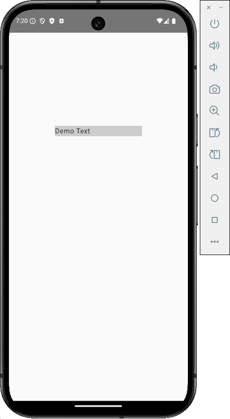
1. Modifier.width(): Sets a fixed width in DP for the composable widget.
Code:
|
1 2 3 4 5 6 7 |
Box( modifier = Modifier .width(200.dp) .background(Color.LightGray) ) { Text("Demo Text") } |
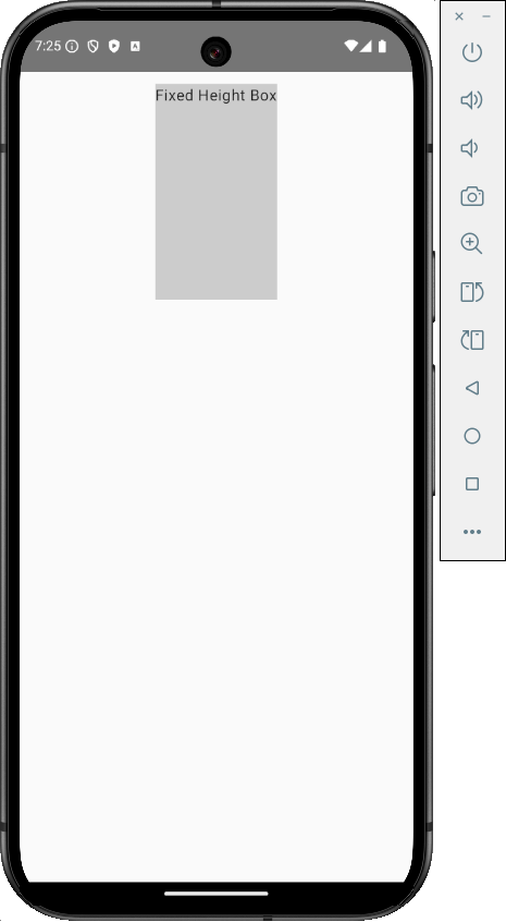
2. Modifier.height(): Sets a fixed height in the DP Density pixel for the composable widget.
Code:
|
1 2 3 4 5 6 7 |
Box( modifier = Modifier .height(300.dp) .background(Color.LightGray) ) { Text("Fixed Height Box") } |
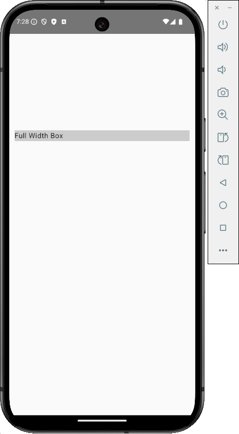
3. Modifier.fillMaxWidth(): The fill max width covers the whole width of its parent widget. It’s the same as Fill Parent or Match Parent attributes in Android.
Code:
|
1 2 3 4 5 6 7 |
Box( modifier = Modifier .fillMaxWidth() .background(Color.LightGray) ) { Text("Full Width Box") } |
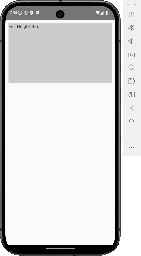
4. Modifier.fillMaxHeight(): The fill max-height property will assign the parent widget height to the child widget.

Code:
|
1 2 3 4 5 6 7 |
Box( modifier = Modifier .fillMaxHeight() .background(Color.LightGray) ) { Text("Full Height Box") } |
5. Modifier.fillMaxSize(): The fill max size property occupies the entire parent width and height of its parent widget to the child widget.
Code:
|
1 2 3 4 5 6 7 |
Box( modifier = Modifier .fillMaxSize() .background(Color.LightGray) ) { Text("Full Height Box") } |
6. Modifier.padding(): The Padding property adds padding to the widget on the top, bottom, left and right sides equally.

Code:
|
1 2 3 4 5 6 7 8 9 |
Box( modifier = Modifier .background(Color.LightGray) ) { Text( text = "Box with Padding", modifier = Modifier.padding(16.dp) ) } |
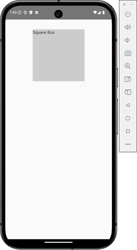
7. Modifier.size(): The size property will set the width and height to the given number in DP.
Code:
|
1 2 3 4 5 6 7 |
Box( modifier = Modifier .size(200.dp) .background(Color.LightGray) ) { Text("Square Box") } |
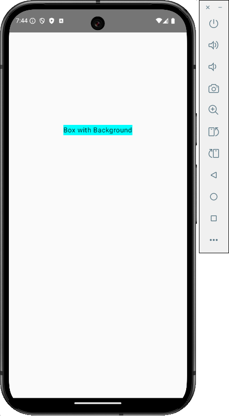
8. Modifier.background(): To set the background color of a Compose Multiplatform widget.
Code:
|
1 2 3 4 5 6 |
Box( modifier = Modifier .background(Color.Cyan) ) { Text("Box with Background") } |
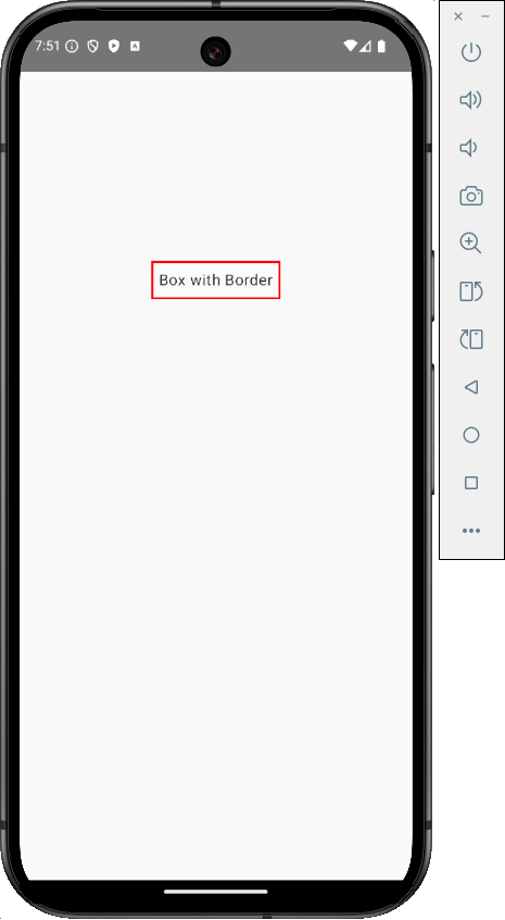
9. Modifier.border(): To set a border around a widget with border width and border color properties.
Code:
|
1 2 3 4 5 6 7 |
Box( modifier = Modifier .border(2.dp, Color.Red) .padding(8.dp) ) { Text("Box with Border") } |
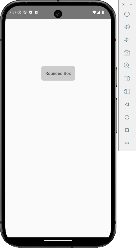
10. Modifier.clip(): To set a widget corner rounded.
Code:
|
1 2 3 4 5 6 7 8 9 10 |
Box( modifier = Modifier .clip(RoundedCornerShape(8.dp)) .background(Color.LightGray) ) { Text( "Rounded Box", modifier = Modifier.padding(16.dp) ) } |
11. Modifier.align(): To align the child widget within its parent widget.

Code:
|
1 2 3 4 5 6 7 |
Box( modifier = Modifier .fillMaxSize(), contentAlignment = Alignment.Center ) { Text("Centered Text") } |
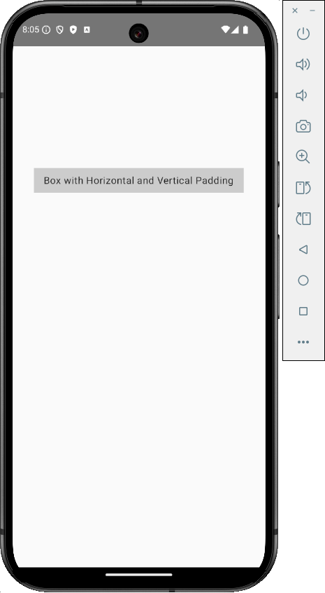
12. Modifier.padding(horizontal = 12.dp, vertical = 12.dp): To set padding on the child widget in Vertical and Horizontal with specific values.
Code:
|
1 2 3 4 5 6 7 8 9 |
Box( modifier = Modifier .background(Color.LightGray) ) { Text( "Box with Horizontal and Vertical Padding", modifier = Modifier.padding(horizontal = 16.dp, vertical = 8.dp) ) } |
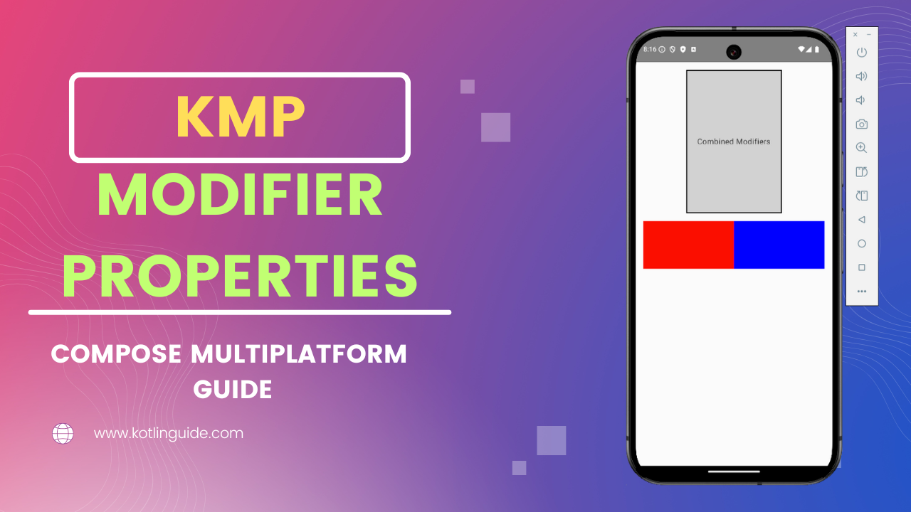
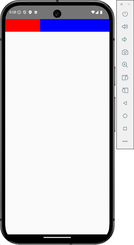
13. Modifier.weight(): To distribute the available space among the children of a Root widget within Column and Row widgets.
Code:
|
1 2 3 4 5 6 7 8 9 10 11 12 13 14 15 16 17 18 19 20 |
@Composable fun Dashboard() { Row( modifier = Modifier.fillMaxWidth() ) { Box( modifier = Modifier .weight(1f) .height(50.dp) .background(Color.Red) ) Box( modifier = Modifier .weight(2f) .height(50.dp) .background(Color.Blue) ) } } |
14. Modifier.padding(start, top, end, bottom): To individually set different padding on all Top, bottom, left and right sides.

Code:
|
1 2 3 4 5 6 7 8 9 10 11 12 |
Box( modifier = Modifier .background(Color.LightGray) ) { Text("Box with Asymmetric Padding", modifier = Modifier.padding( start = 16.dp, top = 8.dp, end = 24.dp, bottom = 12.dp )) } |
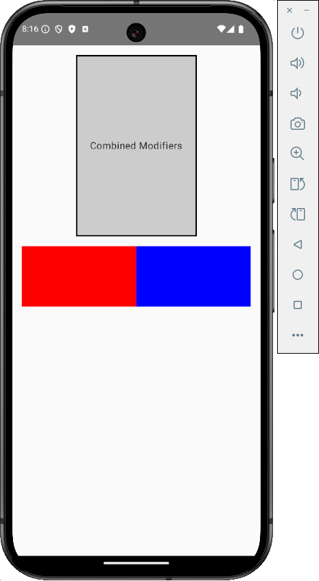
As modifier property names, you can understand their purpose. They can be used together by connecting through the DOT(.) operator. So, we will make an example in which all modifier properties are present.
Modifier properties combine example:
Code:
|
1 2 3 4 5 6 7 8 9 10 11 12 13 14 15 16 17 18 19 20 21 22 23 24 25 26 27 28 29 30 31 32 33 34 35 36 37 38 39 40 41 42 43 44 45 |
@Composable fun CombinedModifiersExample() { Column( modifier = Modifier .fillMaxSize() .padding(16.dp) ) { Box( modifier = Modifier .width(200.dp) .height(300.dp) .background(Color.LightGray) .border(2.dp, Color.Black) .clip(RoundedCornerShape(8.dp)) .align(Alignment.CenterHorizontally) .padding(horizontal = 16.dp, vertical = 8.dp) ) { Text( text = "Combined Modifiers", modifier = Modifier.align(Alignment.Center) ) } Spacer(modifier = Modifier.height(16.dp)) Row( modifier = Modifier .fillMaxWidth() .background(Color.LightGray) ) { Box( modifier = Modifier .weight(1f) .height(100.dp) .background(Color.Red) ) Box( modifier = Modifier .weight(1f) .height(100.dp) .background(Color.Blue) ) } } } |
Thanks for reading our article. Happy reading.