In today’s tutorial, we will discover the complete guide to Material buttons in Kotlin KMP Compose Multiplatform. We will learn about the Simple, Outlined, Text, and Elevated buttons, their properties, and onClick listeners for Android and iOS applications.
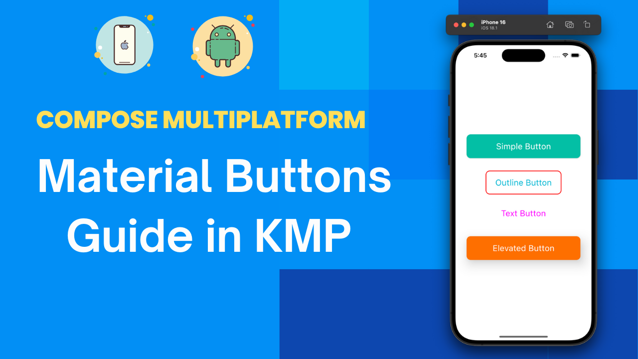
Material Buttons in Kotlin KMP Compose Multiplatform
Buttons are essential UI components in every mobile, web, and desktop application. They allow users to perform certain actions by tapping on a fixed, predefined area on the UI screen. For example, users can tap a button to call a function, call an API, store data in a database, Navigate to the next screen, or perform any other required task.
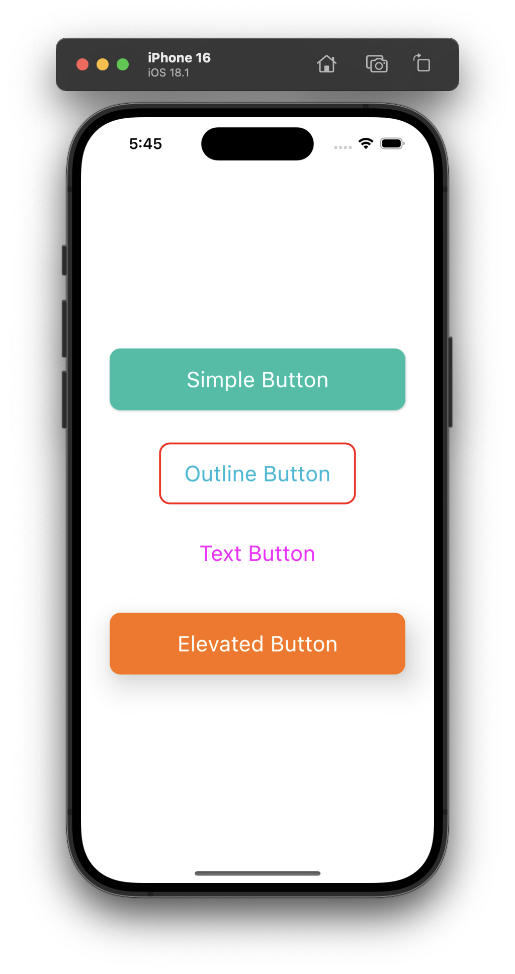
There are the following types of Button widgets available in KMP ComposeMultiplatform:
- Button
- OutlinedButton
- TextButton
- ElevatedButton using Simple Button properties
Common properties in all button widgets:
- onClick: The onClick method calls a function when the user taps the button. The button click body is defined using { } curly brackets, so you can call multiple line codes directly into this block.
- modifier: The modifier sets button width, height, and padding and applies different UI properties. I have already made a tutorial explaining all modifier properties. You can read the tutorial from HERE.
- enabled: The enabled property enabled and disabled the button. To enable, you have to pass true, and to disable the button, pass false. It can also be controlled by State management. So, for certain events, the button will be enabled.
- shape: Define a button shape like a simple rectangle or rounded corner-shaped button.
- colors: These are used to define the button background colour and the button inside text content colour.
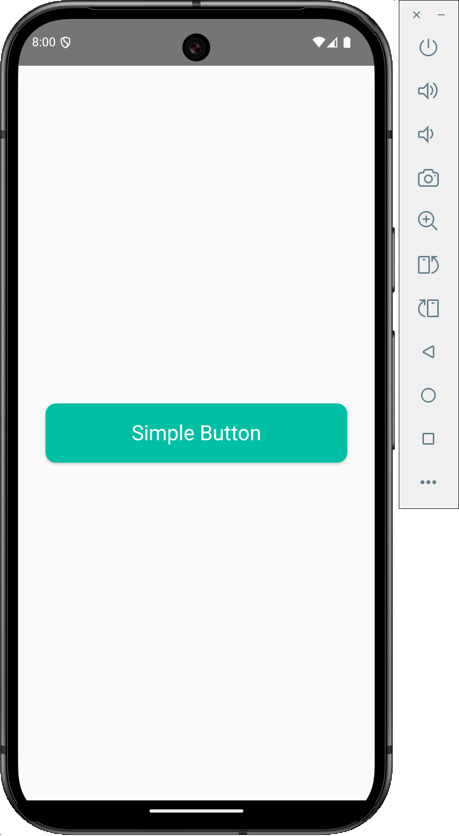
1. Material Button:
The Button widget in KMP is used to create a Material style button.
|
1 2 3 4 5 6 7 8 9 10 11 12 13 14 15 16 17 18 19 20 |
@Composable fun SampleButton() { Button( onClick = { println("Simple Button Clicked") }, modifier = Modifier.padding(24.dp).fillMaxWidth(), enabled = true, interactionSource = remember { MutableInteractionSource() }, shape = RoundedCornerShape(12.dp), colors = ButtonDefaults.buttonColors( contentColor = Color.White, backgroundColor = Color(0xFF00BFA5), ) ) { Text( "Simple Button", style = TextStyle(fontSize = 24.sp), modifier = Modifier.padding(12.dp) ) } } |
Output:
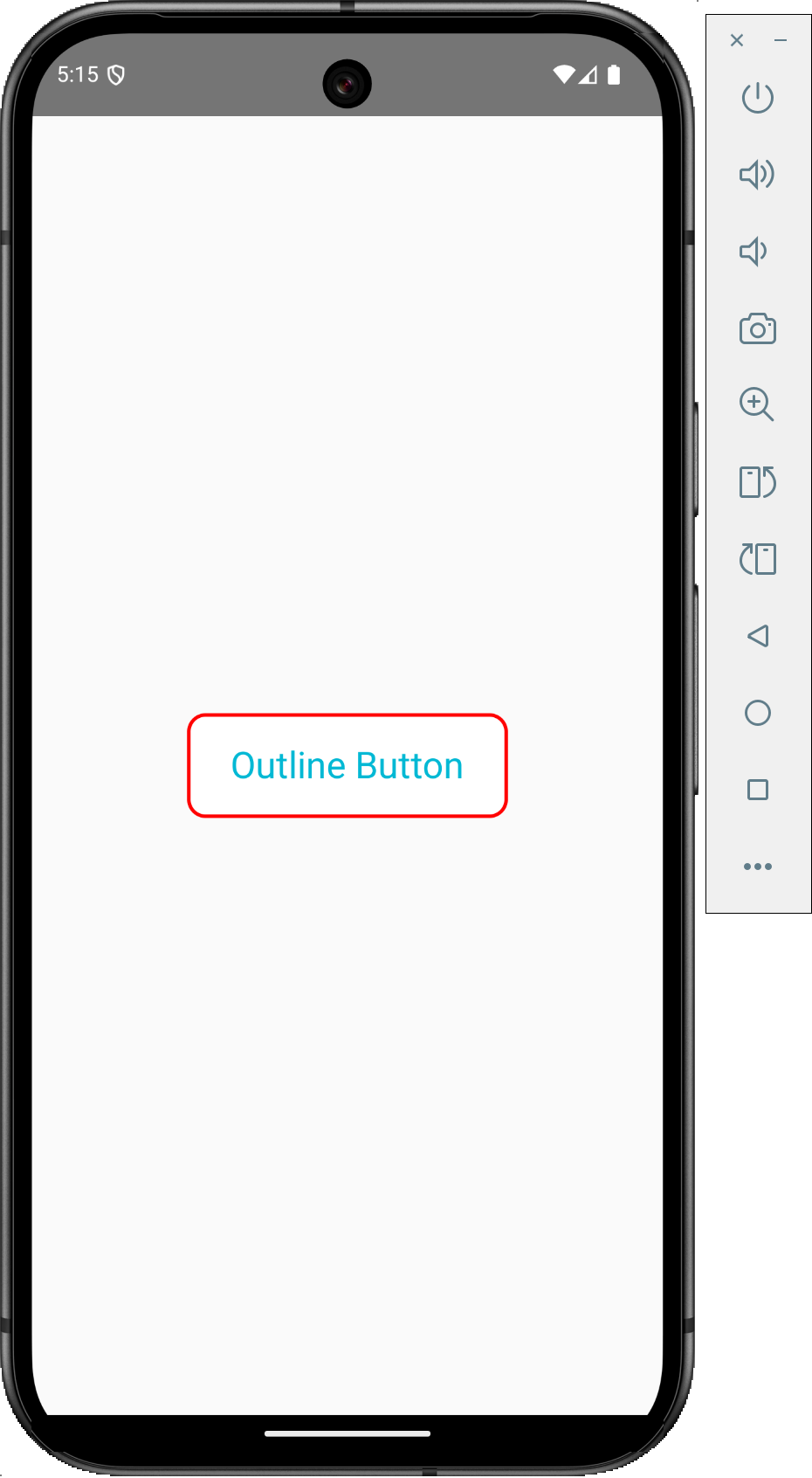
2. OutlinedButton:
The OutlinedButton automatically creates a button with a border around it. We will use the BorderStroke(2.dp, Color.Red) property to create the border. In place of colour constants, you can also use HEX and ARGB colour codes.
|
1 2 3 4 5 6 7 8 9 10 11 12 13 14 15 16 17 18 19 20 21 |
@Composable fun SampleOutlineButton(){ OutlinedButton( onClick = { println("Outlined Button Clicked") }, modifier = Modifier.padding(12.dp).wrapContentSize(), enabled = true, shape = RoundedCornerShape(12.dp), border = BorderStroke(2.dp, Color.Red), colors = ButtonDefaults.outlinedButtonColors( contentColor = Color(0xFF00B8D4), // Do not pass color if want transparent background. // backgroundColor = Color.Yellow ) ) { Text( "Outline Button", style = TextStyle(fontSize = 24.sp), modifier = Modifier.padding(12.dp) ) } } |
Output:
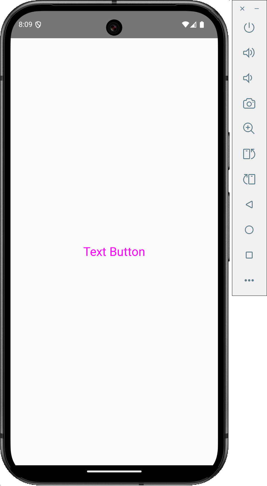
3. TextButton:
Text buttons are simple String text buttons. When a click listener is required to apply on Text, it is used.
|
1 2 3 4 5 6 7 8 9 10 11 12 13 14 15 16 17 18 |
@Composable fun SampleTextButton(){ TextButton( onClick = { println("Text Button Clicked") }, modifier = Modifier.padding(8.dp), enabled = true, colors = ButtonDefaults.textButtonColors( contentColor = Color.Magenta, // backgroundColor = Color.Yellow ) ) { Text( "Text Button", style = TextStyle(fontSize = 24.sp), modifier = Modifier.padding(12.dp) ) } } |
Output:
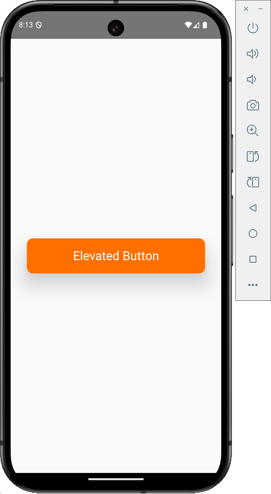
4. Elevated Button:
The elevated button can be created easily using a simple button widget by applying the elevation property. It makes a drop shadow effect beneath the button. Applying the elevation property creates an elevated button within.
|
1 2 3 4 5 6 7 8 9 10 11 12 13 14 15 16 17 18 19 20 21 |
@Composable fun SampleElevatedButton() { Button( onClick = { println("Elevated Button Clicked") }, modifier = Modifier.padding(24.dp).fillMaxWidth(), enabled = true, interactionSource = remember { MutableInteractionSource() }, shape = RoundedCornerShape(12.dp), elevation = ButtonDefaults.elevation(24.dp), colors = ButtonDefaults.buttonColors( contentColor = Color.White, backgroundColor = Color(0xFFFF6F00), ) ) { Text( "Elevated Button", style = TextStyle(fontSize = 24.sp), modifier = Modifier.padding(12.dp) ) } } |
Output:
Complete source code for App.kt file:
|
1 2 3 4 5 6 7 8 9 10 11 12 13 14 15 16 17 18 19 20 21 22 23 24 25 26 27 28 29 30 31 32 33 34 35 36 37 38 39 40 41 42 43 44 45 46 47 48 49 50 51 52 53 54 55 56 57 58 59 60 61 62 63 64 65 66 67 68 69 70 71 72 73 74 75 76 77 78 79 80 81 82 83 84 85 86 87 88 89 90 91 92 93 94 95 96 97 98 99 100 101 102 103 104 105 106 107 108 109 110 111 112 113 114 115 116 117 118 119 120 121 122 123 124 125 |
package com.app.test import androidx.compose.foundation.BorderStroke import androidx.compose.foundation.interaction.MutableInteractionSource import androidx.compose.foundation.layout.Arrangement import androidx.compose.foundation.layout.Column import androidx.compose.foundation.layout.fillMaxSize import androidx.compose.foundation.layout.fillMaxWidth import androidx.compose.foundation.layout.padding import androidx.compose.foundation.layout.wrapContentSize import androidx.compose.foundation.rememberScrollState import androidx.compose.foundation.shape.RoundedCornerShape import androidx.compose.foundation.verticalScroll import androidx.compose.material.* import androidx.compose.runtime.* import androidx.compose.ui.Alignment import androidx.compose.ui.Modifier import androidx.compose.ui.graphics.Color import androidx.compose.ui.text.TextStyle import androidx.compose.ui.unit.dp import androidx.compose.ui.unit.sp @Composable fun App() { MaterialTheme { Column( modifier = Modifier .fillMaxSize() .verticalScroll(rememberScrollState()) .padding(8.dp), verticalArrangement = Arrangement.Center, horizontalAlignment = Alignment.CenterHorizontally, ) { // SampleButton() // SampleOutlineButton() // SampleTextButton() SampleElevatedButton() } } } @Composable fun SampleButton() { Button( onClick = { println("Simple Button Clicked") }, modifier = Modifier.padding(24.dp).fillMaxWidth(), enabled = true, interactionSource = remember { MutableInteractionSource() }, shape = RoundedCornerShape(12.dp), colors = ButtonDefaults.buttonColors( contentColor = Color.White, backgroundColor = Color(0xFF00BFA5), ) ) { Text( "Simple Button", style = TextStyle(fontSize = 24.sp), modifier = Modifier.padding(12.dp) ) } } @Composable fun SampleOutlineButton(){ OutlinedButton( onClick = { println("Outlined Button Clicked") }, modifier = Modifier.padding(12.dp).wrapContentSize(), enabled = true, shape = RoundedCornerShape(12.dp), border = BorderStroke(2.dp, Color.Red), colors = ButtonDefaults.outlinedButtonColors( contentColor = Color(0xFF00B8D4), // Do not pass color if want transparent background. // backgroundColor = Color.Yellow ) ) { Text( "Outline Button", style = TextStyle(fontSize = 24.sp), modifier = Modifier.padding(12.dp) ) } } @Composable fun SampleTextButton(){ TextButton( onClick = { println("Text Button Clicked") }, modifier = Modifier.padding(8.dp), enabled = true, colors = ButtonDefaults.textButtonColors( contentColor = Color.Magenta, // backgroundColor = Color.Yellow ) ) { Text( "Text Button", style = TextStyle(fontSize = 24.sp), modifier = Modifier.padding(12.dp) ) } } @Composable fun SampleElevatedButton() { Button( onClick = { println("Elevated Button Clicked") }, modifier = Modifier.padding(24.dp).fillMaxWidth(), enabled = true, interactionSource = remember { MutableInteractionSource() }, shape = RoundedCornerShape(12.dp), elevation = ButtonDefaults.elevation(24.dp), colors = ButtonDefaults.buttonColors( contentColor = Color.White, backgroundColor = Color(0xFFFF6F00), ) ) { Text( "Elevated Button", style = TextStyle(fontSize = 24.sp), modifier = Modifier.padding(12.dp) ) } } |
Screenshot: