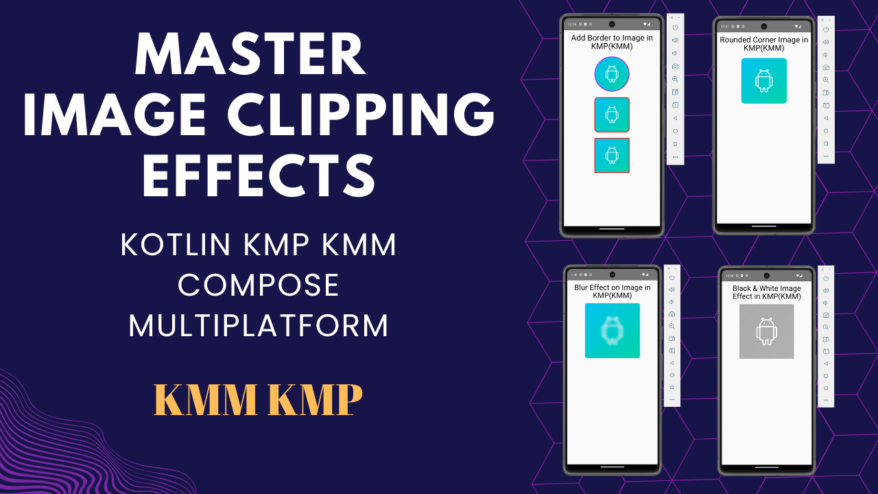
This tutorial teaches master image clipping & effects in Kotlin KMP & KMM for Android and iOS apps. Explore circular and oval shapes, rounded corners, image borders, gradient effects, blend modes, camera reel effects, custom aspect ratios, tint overlays, black & white filters, and blur effects.
Master Image Clipping & Effects in Kotlin KMP KMM Compose
We are using a demo image in this tutorial. You can download the image from below for learning purposes.
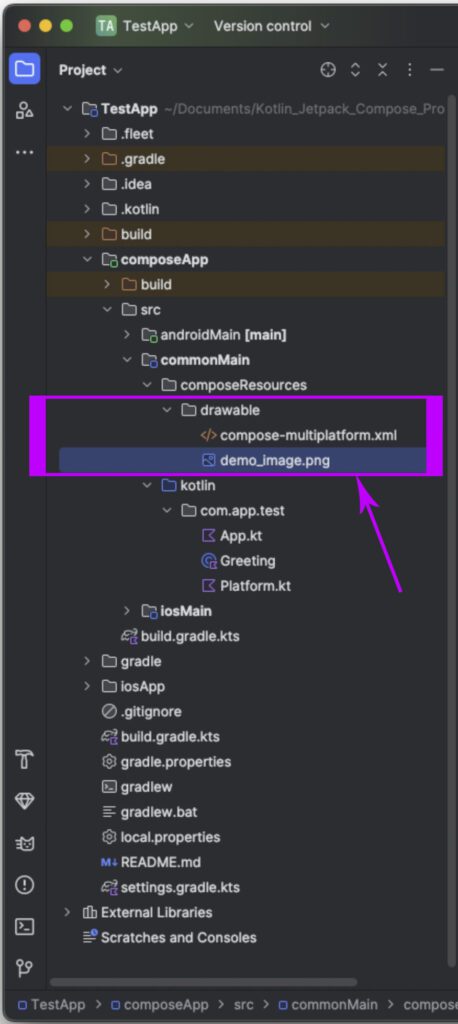
After downloading, Please put the image into :
composeApp -> commonMain -> composeResource -> drawable folder.
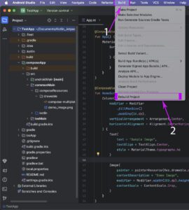
After pasting the image, You have to Clean and rebuild the project. So the local image will be available for Local common shared resources.
Now, our image setup is complete. Let’s move to the next step, where we learn Clipping images in Kotlin Compose Multiplatform.
1. CircleShape Image:
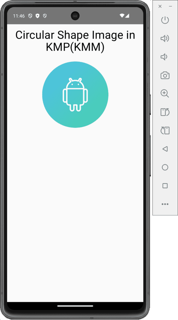
The Image component in Kotlin Compose Multiplatform has a property clip in Modifier. The clip supports a property called CircleShape, which automatically converts our image into a circular shape.
|
1 2 3 4 5 6 7 8 |
Image( painter = painterResource(Res.drawable.demo_image), contentDescription = "Demo Image", contentScale = ContentScale.Crop, modifier = Modifier .size(200.dp) .clip(CircleShape) ) |
Code explanation:
- painter: To draw the image.
- painterResource: To retrieve the drawable resource image of the painter.
- Res: represents local app resource.
- drawable: Locate the local common main resource drawable folder.
- contentDescription: Description of the Image.
- contentScale: How the image should be scaled within the current View.
- clip: To apply Clipping to the image.
- CircleShape: Apply circular shape clipping to the image.
Complete code for App.kt file:
|
1 2 3 4 5 6 7 8 9 10 11 12 13 14 15 16 17 18 19 20 21 22 23 24 25 26 27 28 29 30 31 32 33 34 35 36 37 38 39 40 41 42 43 44 45 46 47 48 49 50 51 52 53 54 55 56 57 |
package com.app.test import androidx.compose.foundation.Image import androidx.compose.foundation.layout.Arrangement import androidx.compose.foundation.layout.Column import androidx.compose.foundation.layout.Spacer import androidx.compose.foundation.layout.fillMaxWidth import androidx.compose.foundation.layout.height import androidx.compose.foundation.layout.padding import androidx.compose.foundation.layout.size import androidx.compose.foundation.shape.CircleShape import androidx.compose.material.MaterialTheme import androidx.compose.material.Text import androidx.compose.runtime.* import androidx.compose.ui.Alignment import androidx.compose.ui.Modifier import androidx.compose.ui.draw.clip import androidx.compose.ui.graphics.Color import androidx.compose.ui.layout.ContentScale import androidx.compose.ui.text.style.TextAlign import androidx.compose.ui.unit.dp import org.jetbrains.compose.resources.painterResource import testapp.composeapp.generated.resources.Res import testapp.composeapp.generated.resources.demo_image @Composable fun App() { MaterialTheme { Column( modifier = Modifier .padding(12.dp) .fillMaxWidth(), verticalArrangement = Arrangement.Top, horizontalAlignment = Alignment.CenterHorizontally ) { Text( text = "Circular Shape Image in KMP(KMM)", style = MaterialTheme.typography.h4, color = Color.Black, textAlign = TextAlign.Center ) Spacer(modifier = Modifier.height(24.dp)) Image( painter = painterResource(Res.drawable.demo_image), contentDescription = "Demo Image", contentScale = ContentScale.Crop, modifier = Modifier .size(200.dp) .clip(CircleShape) ) } } } |
Screenshot:
2. Rounded Corner Image:
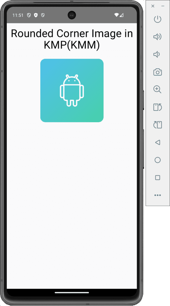
To create a rounded corner image in KMM KMP, we will pass the RoundedCornerShape() property to the clip.
|
1 2 3 4 5 6 7 8 |
Image( painter = painterResource(Res.drawable.demo_image), contentDescription = "Demo Image", contentScale = ContentScale.Crop, modifier = Modifier .size(200.dp) .clip(RoundedCornerShape(16.dp)) ) |
Screenshot:
3. Oval Shape Image:
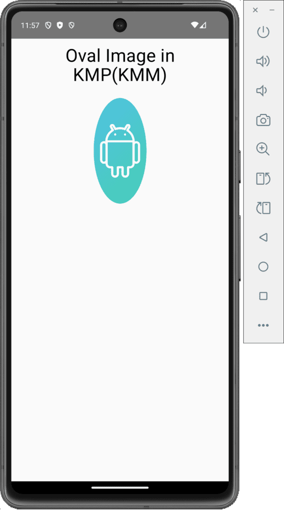
In KMP, we cannot directly use the Oval shape. We must create a custom shape using Path and Rect to make the Oval shape.
- Create a SquashedOval class that extends the Shape class. In this class, we define our Oval shape.
12345678910111213141516171819class SquashedOval : Shape {override fun createOutline(size: Size,layoutDirection: LayoutDirection,density: Density): Outline {val path = Path().apply {addOval(Rect(left = size.width / 4f,top = 0f,right = size.width * 3 / 4f,bottom = size.height))}return Outline.Generic(path = path)}} - Calling the SquashedOval class into our Image in the clip.
12345678Image(painter = painterResource(Res.drawable.demo_image),contentDescription = "Demo Image",contentScale = ContentScale.Crop,modifier = Modifier.size(200.dp).clip(SquashedOval()))
Complete source code:
|
1 2 3 4 5 6 7 8 9 10 11 12 13 14 15 16 17 18 19 20 21 22 23 24 25 26 27 28 29 30 31 32 33 34 35 36 37 38 39 40 41 42 43 44 45 46 47 48 49 50 51 52 53 54 55 56 57 58 59 60 61 62 63 64 65 66 67 68 69 70 71 72 73 74 75 76 77 78 79 80 81 82 83 84 85 |
package com.app.test import androidx.compose.foundation.Image import androidx.compose.foundation.layout.Arrangement import androidx.compose.foundation.layout.Column import androidx.compose.foundation.layout.Spacer import androidx.compose.foundation.layout.fillMaxWidth import androidx.compose.foundation.layout.height import androidx.compose.foundation.layout.padding import androidx.compose.foundation.layout.size import androidx.compose.foundation.shape.RoundedCornerShape import androidx.compose.material.MaterialTheme import androidx.compose.material.Text import androidx.compose.runtime.* import androidx.compose.ui.Alignment import androidx.compose.ui.Modifier import androidx.compose.ui.draw.clip import androidx.compose.ui.geometry.Rect import androidx.compose.ui.geometry.Size import androidx.compose.ui.graphics.Color import androidx.compose.ui.graphics.Outline import androidx.compose.ui.graphics.Path import androidx.compose.ui.graphics.Shape import androidx.compose.ui.layout.ContentScale import androidx.compose.ui.text.style.TextAlign import androidx.compose.ui.unit.Density import androidx.compose.ui.unit.LayoutDirection import androidx.compose.ui.unit.dp import org.jetbrains.compose.resources.painterResource import testapp.composeapp.generated.resources.Res import testapp.composeapp.generated.resources.demo_image @Composable fun App() { MaterialTheme { Column( modifier = Modifier .padding(12.dp) .fillMaxWidth(), verticalArrangement = Arrangement.Top, horizontalAlignment = Alignment.CenterHorizontally ) { Text( text = "Oval Image in KMP(KMM)", style = MaterialTheme.typography.h4, color = Color.Black, textAlign = TextAlign.Center ) Spacer(modifier = Modifier.height(24.dp)) Image( painter = painterResource(Res.drawable.demo_image), contentDescription = "Demo Image", contentScale = ContentScale.Crop, modifier = Modifier .size(200.dp) .clip(SquashedOval()) ) } } } class SquashedOval : Shape { override fun createOutline( size: Size, layoutDirection: LayoutDirection, density: Density ): Outline { val path = Path().apply { addOval( Rect( left = size.width / 4f, top = 0f, right = size.width * 3 / 4f, bottom = size.height ) ) } return Outline.Generic(path = path) } } |
Screenshot:
4. Adding a border to the Image in KMP KMM Compose Multiplatform:
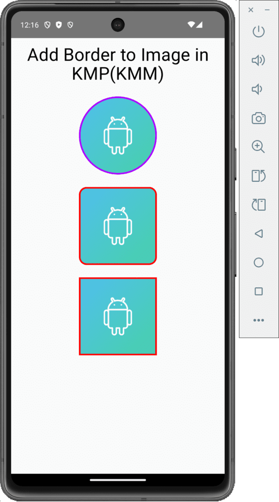
To add a border to the image in KMM, KMP, we have to use a Modifier property border() and its sub-property BorderStroke().
1. Adding a border to Circle shape image:
|
1 2 3 4 5 6 7 8 9 10 11 12 13 14 15 |
val borderWidth = 3.dp Image( painter = painterResource(Res.drawable.demo_image), contentDescription = "Demo Image", contentScale = ContentScale.Crop, modifier = Modifier .size(150.dp) .border( BorderStroke(borderWidth, Color(0xffAA00FF)), CircleShape ) .padding(borderWidth) .clip(CircleShape) ) |
Code explanation:
- borderWidth: We have to define the width of the border.
- BorderStroke(): It supports two properties: border width and border color.
- CircleShape: Pass the shape of the Image. The border will be applied to the default image shape if not passed.
2. Adding a border to the Rounded corner shape image:
|
1 2 3 4 5 6 7 8 9 10 11 12 13 14 15 |
val borderWidth = 3.dp Image( painter = painterResource(Res.drawable.demo_image), contentDescription = "Demo Image", contentScale = ContentScale.Crop, modifier = Modifier .size(150.dp) .border( BorderStroke(borderWidth, Color.Red), RoundedCornerShape(15.dp) ) .padding(borderWidth) .clip(RoundedCornerShape(12.dp)) ) |
3. Adding a border to the default Rectangle shape image:
|
1 2 3 4 5 6 7 8 9 10 11 12 13 14 15 |
val borderWidth = 3.dp Image( painter = painterResource(Res.drawable.demo_image), contentDescription = "Demo Image", contentScale = ContentScale.Crop, modifier = Modifier .size(150.dp) .border( BorderStroke(borderWidth, Color.Red), RectangleShape ) .padding(borderWidth) .clip(RectangleShape) ) |
Screenshot:
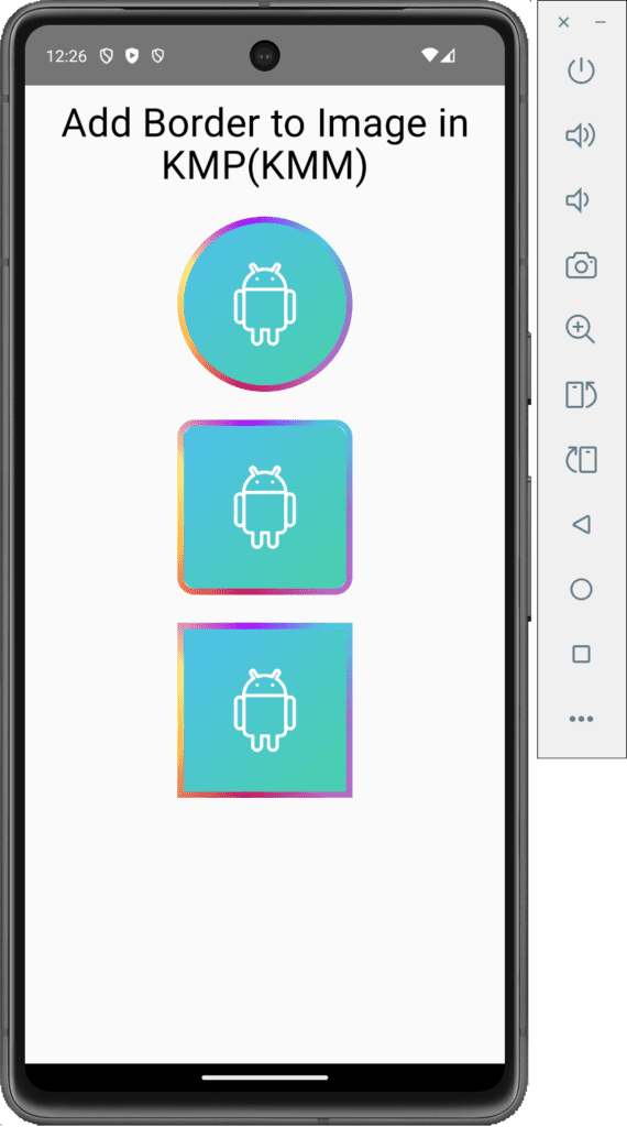
4. Adding a Gradient border to the Image in KMP KMM:
To add the Gradient effect to the border on the Image, We have to create a Brush with Sweep Gradient custom component. We have to define multiple colors in a list. These colors will be applied in the gradient effect.
|
1 2 3 4 5 6 7 8 9 10 11 12 13 14 |
val rainbowColorsBrush = remember { Brush.sweepGradient( listOf( Color(0xFF9575CD), Color(0xFFBA68C8), Color(0xFFC51162), Color(0xFFFFB74D), Color(0xFFFFF176), Color(0xFFAA00FF), Color(0xFF4DD0E1), Color(0xFF9575CD) ) ) } |
Now we must call this rainbowColorsBrush in our Image in Border Stroke property and pass at the place of Color.
Complete source code:
|
1 2 3 4 5 6 7 8 9 10 11 12 13 14 15 16 17 18 19 20 21 22 23 24 25 26 27 28 29 30 31 32 33 34 35 36 37 38 39 40 41 42 43 44 45 46 47 48 49 50 51 52 53 54 55 56 57 58 59 60 61 62 63 64 65 66 67 68 69 70 71 72 73 74 75 76 77 78 79 80 81 82 83 84 85 86 87 88 89 90 91 92 93 94 95 96 97 98 99 100 101 102 103 104 105 106 107 108 109 110 111 112 113 114 115 116 117 |
package com.app.test import androidx.compose.foundation.BorderStroke import androidx.compose.foundation.Image import androidx.compose.foundation.border import androidx.compose.foundation.layout.Arrangement import androidx.compose.foundation.layout.Column import androidx.compose.foundation.layout.Spacer import androidx.compose.foundation.layout.fillMaxWidth import androidx.compose.foundation.layout.height import androidx.compose.foundation.layout.padding import androidx.compose.foundation.layout.size import androidx.compose.foundation.shape.CircleShape import androidx.compose.foundation.shape.RoundedCornerShape import androidx.compose.material.MaterialTheme import androidx.compose.material.Text import androidx.compose.runtime.* import androidx.compose.ui.Alignment import androidx.compose.ui.Modifier import androidx.compose.ui.draw.clip import androidx.compose.ui.graphics.Brush import androidx.compose.ui.graphics.Color import androidx.compose.ui.graphics.RectangleShape import androidx.compose.ui.layout.ContentScale import androidx.compose.ui.text.style.TextAlign import androidx.compose.ui.unit.dp import org.jetbrains.compose.resources.painterResource import testapp.composeapp.generated.resources.Res import testapp.composeapp.generated.resources.demo_image @Composable fun App() { MaterialTheme { Column( modifier = Modifier .padding(12.dp) .fillMaxWidth(), verticalArrangement = Arrangement.Top, horizontalAlignment = Alignment.CenterHorizontally ) { Text( text = "Add Border to Image in KMP(KMM)", style = MaterialTheme.typography.h4, color = Color.Black, textAlign = TextAlign.Center ) Spacer(modifier = Modifier.height(24.dp)) val borderWidth = 5.dp val rainbowColorsBrush = remember { Brush.sweepGradient( listOf( Color(0xFF9575CD), Color(0xFFBA68C8), Color(0xFFC51162), Color(0xFFFFB74D), Color(0xFFFFF176), Color(0xFFAA00FF), Color(0xFF4DD0E1), Color(0xFF9575CD) ) ) } Image( painter = painterResource(Res.drawable.demo_image), contentDescription = "Demo Image", contentScale = ContentScale.Crop, modifier = Modifier .size(150.dp) .border( BorderStroke(borderWidth, rainbowColorsBrush), CircleShape ) .padding(borderWidth) .clip(CircleShape) ) Spacer(modifier = Modifier.height(24.dp)) Image( painter = painterResource(Res.drawable.demo_image), contentDescription = "Demo Image", contentScale = ContentScale.Crop, modifier = Modifier .size(150.dp) .border( BorderStroke(borderWidth, rainbowColorsBrush), RoundedCornerShape(15.dp) ) .padding(borderWidth) .clip(RoundedCornerShape(12.dp)) ) Spacer(modifier = Modifier.height(24.dp)) Image( painter = painterResource(Res.drawable.demo_image), contentDescription = "Demo Image", contentScale = ContentScale.Crop, modifier = Modifier .size(150.dp) .border( BorderStroke(borderWidth, rainbowColorsBrush), RectangleShape ) .padding(borderWidth) .clip(RectangleShape) ) } } } |
Screenshot:
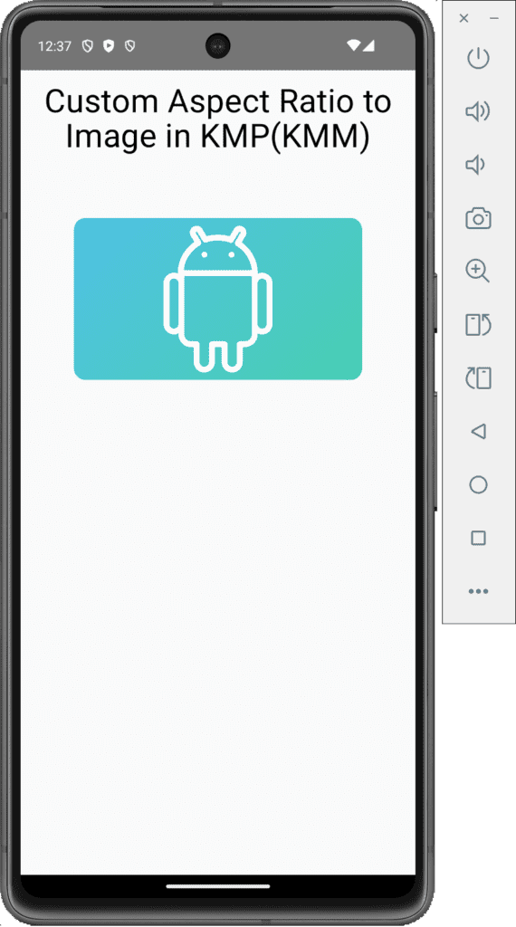
5. Set Custom Aspect Ratio Image in KMP KMM:
To set the image in a custom aspect ratio, we will use Modifier.aspectRatio() property.
|
1 2 3 4 5 6 7 8 9 |
Image( painter = painterResource(Res.drawable.demo_image), contentDescription = "Demo Image", contentScale = ContentScale.Crop, modifier = Modifier .size(300.dp) .clip(RoundedCornerShape(12.dp)) .aspectRatio(16f / 9f) ) |
Screenshot:
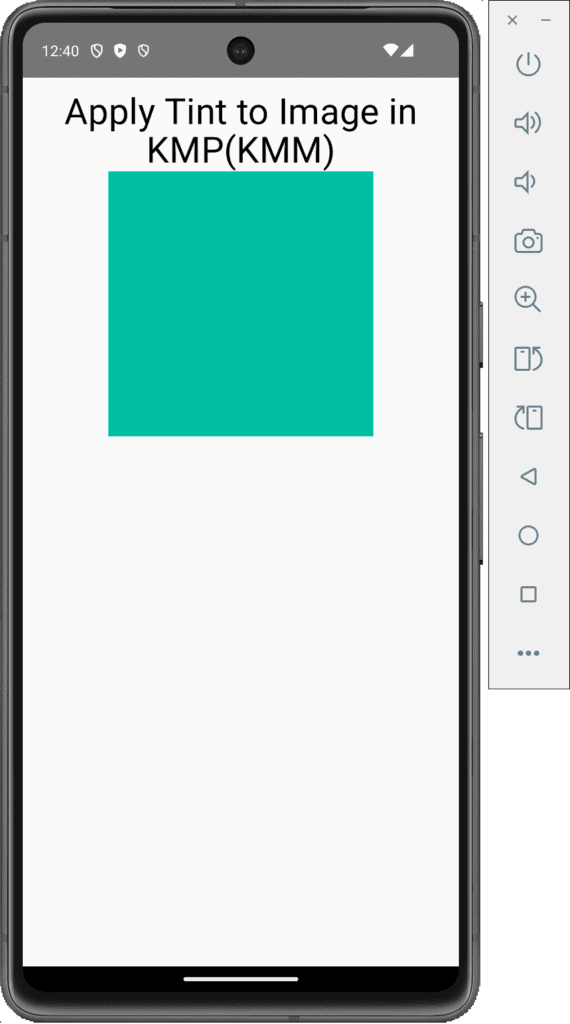
6. Apply Tint on Image in KMP KMM:
To apply tint color to the image component, we will use ColorFilter.tint(Color Code) property.
|
1 2 3 4 5 6 7 8 |
Image( painter = painterResource(Res.drawable.demo_image), contentDescription = "Demo Image", contentScale = ContentScale.Crop, modifier = Modifier .size(250.dp), colorFilter = ColorFilter.tint(Color(0xff00BFA5)) ) |
Screenshot:
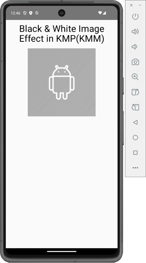
7. Applying Black & White Effect on Image in KMP KMM:
To apply the Back & the White effect on the Image, we will use
ColorFilter.colorMatrix(ColorMatrix().apply { setToSaturation(0f) }) property.
|
1 2 3 4 5 6 7 8 |
Image( painter = painterResource(Res.drawable.demo_image), contentDescription = "Demo Image", contentScale = ContentScale.Crop, modifier = Modifier .size(250.dp), colorFilter = ColorFilter.colorMatrix(ColorMatrix().apply { setToSaturation(0f) }) ) |
Screenshot:
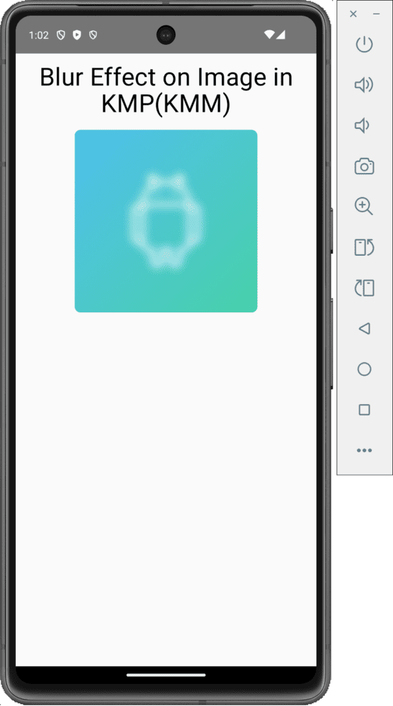
7. Applying Blur Effect to Image in KMP KMM:
To apply the Blur effect to an Image, we will use the blur property with radius X, radius Y and edge treatment.
|
1 2 3 4 5 6 7 8 9 10 11 12 |
Image( painter = painterResource(Res.drawable.demo_image), contentDescription = "Demo Image", contentScale = ContentScale.Crop, modifier = Modifier .size(250.dp) .blur( radiusX = 10.dp, radiusY = 10.dp, edgeTreatment = BlurredEdgeTreatment(RoundedCornerShape(8.dp)) ) ) |
Screenshot:
Thanks for reading our article. If you have any questions regarding the tutorial, please comment. Happy Coding.

