The KMP Compose Multiplatform FlowRow widget is a multipurpose widget that allows us to arrange items horizontally. When items exceed the device width, they are automatically moved to the next row in a single row. It is beneficial when we want to create a dynamic GridView in KMP Compose Multiplatform.
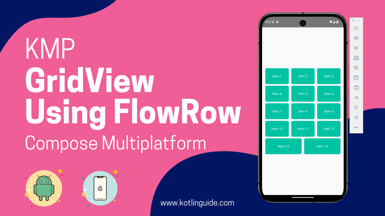
GridView in KMP Compose Multiplatform Using FlowRow
In a GridView layout, all list items are displayed in a structured grid. The items are automatically arranged into rows and columns, similar to a Table structure. GridView displays large sets of data together, similar to our mobile phone Gallery, where images are shown in Grid format.
FlowRow characteristics:
- Handle data that cannot be shown in a single row.
- Enable automatically multiple line content wrapping.
- Enable similar alignment and spacing between all the Grid items.
When to use FlowRow?
When you have many items, such as sorting filter data, dynamic chips, and Image GridView, the flow row is proper.
Start Coding for GridView in KMP Compose Multiplatform:
1. First, we must create a Root Column widget with a vertical scroll view enabled. To enable this view, we will use the “verticalScroll(rememberScrollState())” property of the Modifier.
|
1 2 3 4 5 6 7 8 9 10 |
Column( modifier = Modifier .fillMaxSize() .verticalScroll(rememberScrollState()) .padding(8.dp), verticalArrangement = Arrangement.Center, horizontalAlignment = Alignment.CenterHorizontally, ) { TestGridView() } |
2. Creating FlowRow widget.
- maxItemsInEachRow: To set how many items will be displayed in a single row.
- itemModifier: To dynamically create a wrap content View layout with layout weight complete.
- repeat(): In the repeat method, I am passing a fixed value, but when using it with APIs or dynamic data, you have to pass the length of your list here.
|
1 2 3 4 5 6 7 8 9 10 11 12 13 14 15 16 17 18 19 20 21 22 23 24 25 26 27 28 29 30 31 32 33 34 35 36 37 38 39 |
@OptIn(ExperimentalLayoutApi::class, ExperimentalMaterialApi::class) @Composable private fun TestGridView() { val rows = 3 val columns = 4 FlowRow( modifier = Modifier.padding(4.dp), horizontalArrangement = Arrangement.spacedBy(4.dp), maxItemsInEachRow = rows ) { val itemModifier = Modifier .padding(4.dp) .height(80.dp) .weight(1f) .clip(RoundedCornerShape(8.dp)) .background(Color.Cyan) repeat(100) { Surface( modifier = itemModifier, shape = RoundedCornerShape(8.dp), color = Color(0xFF00BFA5), elevation = 4.dp, onClick = { } ) { Box( modifier = Modifier.fillMaxSize(), contentAlignment = Alignment.Center ) { Text( text = "Item ${it + 1}", color = Color.White, style = MaterialTheme.typography.body1 ) } } } } } |
These three properties are essential and explainable. You can understand other properties by their names.
Complete source code for App.kt file:
|
1 2 3 4 5 6 7 8 9 10 11 12 13 14 15 16 17 18 19 20 21 22 23 24 25 26 27 28 29 30 31 32 33 34 35 36 37 38 39 40 41 42 43 44 45 46 47 48 49 50 51 52 53 54 55 56 57 58 59 60 61 62 63 64 65 66 67 68 69 70 71 72 73 74 75 76 77 |
package com.app.test import androidx.compose.foundation.background import androidx.compose.foundation.layout.Arrangement import androidx.compose.foundation.layout.Box import androidx.compose.foundation.layout.Column import androidx.compose.foundation.layout.ExperimentalLayoutApi import androidx.compose.foundation.layout.FlowRow import androidx.compose.foundation.layout.fillMaxSize import androidx.compose.foundation.layout.height import androidx.compose.foundation.layout.padding import androidx.compose.foundation.rememberScrollState import androidx.compose.foundation.shape.RoundedCornerShape import androidx.compose.foundation.verticalScroll import androidx.compose.material.* import androidx.compose.runtime.* import androidx.compose.ui.Alignment import androidx.compose.ui.Modifier import androidx.compose.ui.draw.clip import androidx.compose.ui.graphics.Color import androidx.compose.ui.unit.dp @Composable fun App() { MaterialTheme { Column( modifier = Modifier .fillMaxSize() .verticalScroll(rememberScrollState()) .padding(8.dp), verticalArrangement = Arrangement.Center, horizontalAlignment = Alignment.CenterHorizontally, ) { TestGridView() } } } @OptIn(ExperimentalLayoutApi::class, ExperimentalMaterialApi::class) @Composable private fun TestGridView() { val rows = 3 val columns = 4 FlowRow( modifier = Modifier.padding(4.dp), horizontalArrangement = Arrangement.spacedBy(4.dp), maxItemsInEachRow = rows ) { val itemModifier = Modifier .padding(4.dp) .height(80.dp) .weight(1f) .clip(RoundedCornerShape(8.dp)) .background(Color.Cyan) repeat(100) { Surface( modifier = itemModifier, shape = RoundedCornerShape(8.dp), color = Color(0xFF00BFA5), elevation = 4.dp, onClick = { } ) { Box( modifier = Modifier.fillMaxSize(), contentAlignment = Alignment.Center ) { Text( text = "Item ${it + 1}", color = Color.White, style = MaterialTheme.typography.body1 ) } } } } } |
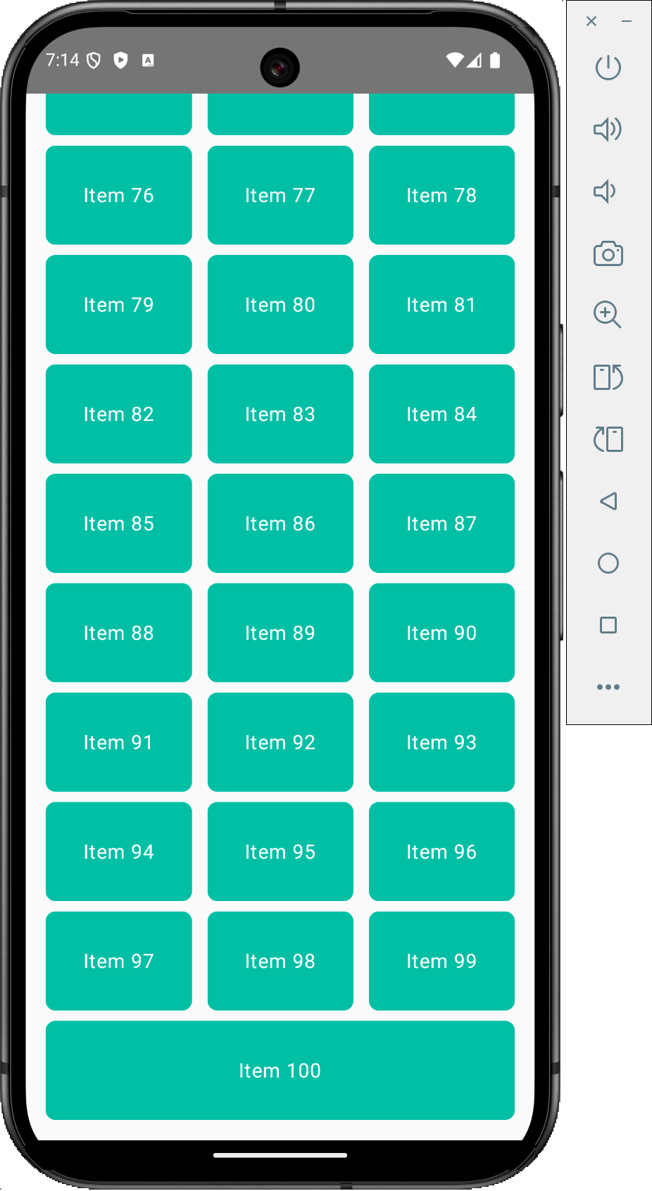
Screenshot: