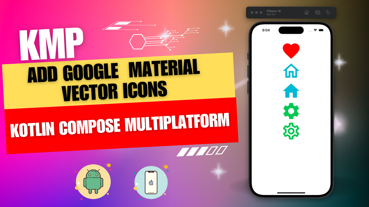
In today’s tutorial, we will learn How to integrate Google material vector icons in KMP Kotlin Compose Multiplatform for Android, iOS, and Desktop applications.
Integrate Google Material Vector Icons in KMP Compose Multiplatform:
Google Material Icons is one of the best free icon platforms available online. You can download free vector icons from fonts.google.com/icons. Material libraries can distribute these icons more conveniently on mobile and web platforms. One of them is the “material-icons-extended” library. With the help of this library, we can easily access material icons in the Kotlin Compose multiplatform application. Now, let’s get started with the library installation and icon integration.
Add Material Icons dependency in KMP Kotlin Compose Multiplatform app.
1. Open your KMP or KMM project’s build.gradle.kts file.
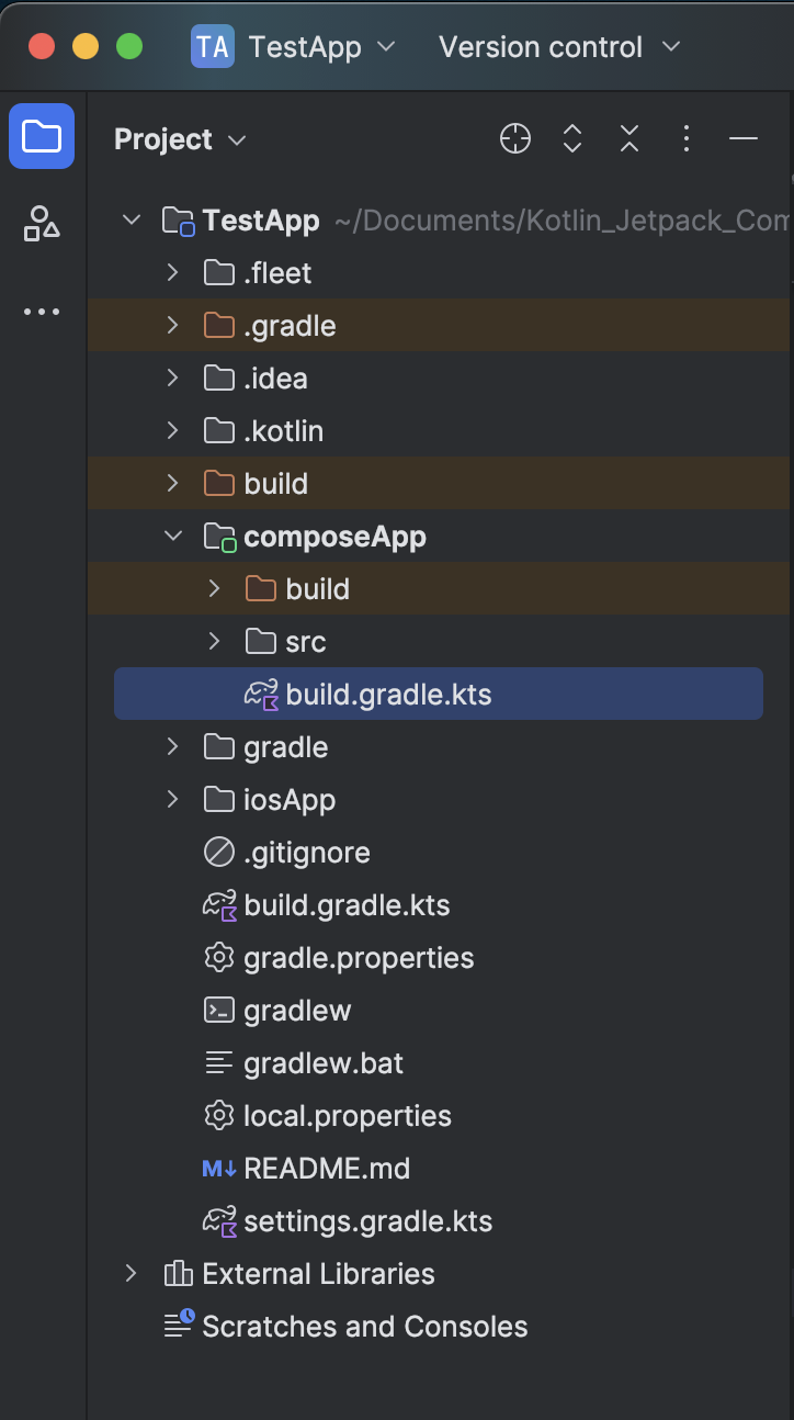
2. Put the material dependency below in the common main section. You can find the latest version of this dependency on Maven. Here is the link: mvnrepository.com.
|
1 2 3 4 5 |
commonMain.dependencies { implementation("org.jetbrains.compose.material:material-icons-extended:1.7.3") } |
3. Click on the SYNC NOW button and wait a few minutes to download and Sync the dependency in your project.
Start coding for the app:
1. After syncing the project, all the material vector icons will be accessible in your project. You can find the list of all vector icons HERE.
2. Open your project’s App.kt file and integrate code for creating your first Google material vector icon.
|
1 2 3 4 5 6 |
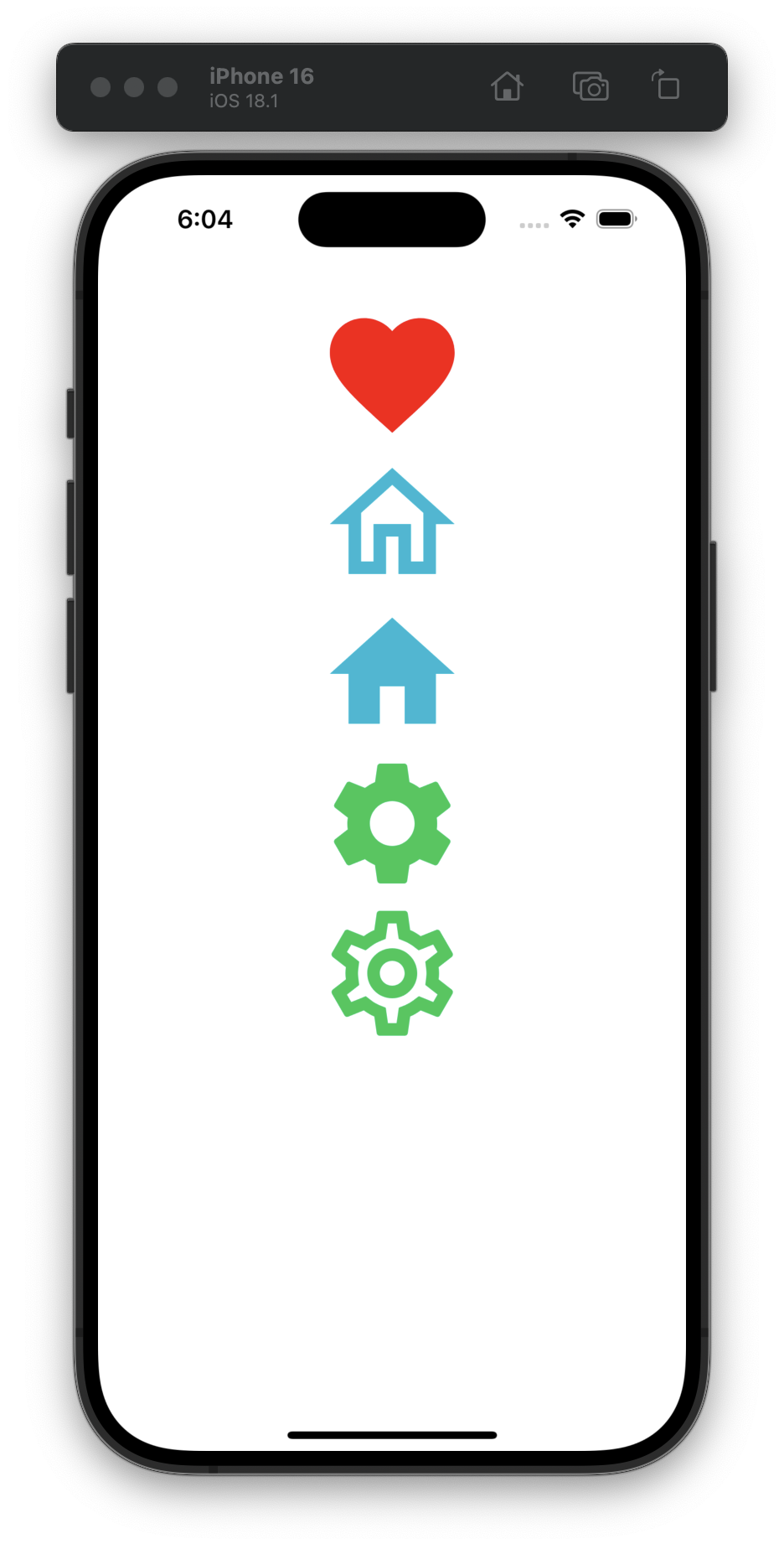
Icon( imageVector = Icons.Outlined.Favorite, contentDescription = "Favorite icon", tint = Color.Red, modifier = Modifier.size(100.dp) ) |
Code explanation:
- imageVector: Vector icon name. There are two icon types: Outlined and Filled.
- contentDescription: Small description of your icon.
- tint: Icon background color.
- modifier: To set icon width, height padding, and more. You can learn more about the Modifier properties HERE.
Output:

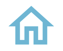
3. Creating a Home outlined icon. I am using the HEX color code for this icon. In this code, “0xFF00B8D4,” oxFF is a prefix, and after that, put your HEX color code.
|
1 2 3 4 5 6 |
Icon( imageVector = Icons.Outlined.Home, contentDescription = "Home icon outlined", tint = Color(0xFF00B8D4), modifier = Modifier.size(100.dp) ) |
Output:
4. Creating Home filled icon.
|
1 2 3 4 5 6 |
Icon( imageVector = Icons.Filled.Home, contentDescription = "Favorite icon filled", tint = Color(0xFF00B8D4), modifier = Modifier.size(100.dp) ) |
Output:

5. Creating Setting Filled and Outlined icons.
|
1 2 3 4 5 6 7 8 9 10 11 12 13 |
Icon( imageVector = Icons.Filled.Settings, contentDescription = "Settings icon filled", tint = Color(0xFF00C853), modifier = Modifier.size(100.dp) ) Icon( imageVector = Icons.Outlined.Settings, contentDescription = "Settings icon outlined", tint = Color(0xFF00C853), modifier = Modifier.size(100.dp) ) |
Output:

Complete source code for App.kt file:
|
1 2 3 4 5 6 7 8 9 10 11 12 13 14 15 16 17 18 19 20 21 22 23 24 25 26 27 28 29 30 31 32 33 34 35 36 37 38 39 40 41 42 43 44 45 46 47 48 49 50 51 52 53 54 55 56 57 58 59 60 61 62 63 64 65 66 67 68 69 70 71 72 73 74 75 |
package com.app.test import androidx.compose.foundation.layout.Arrangement import androidx.compose.foundation.layout.Box import androidx.compose.foundation.layout.Column import androidx.compose.foundation.layout.fillMaxSize import androidx.compose.foundation.layout.padding import androidx.compose.foundation.layout.size import androidx.compose.foundation.rememberScrollState import androidx.compose.foundation.verticalScroll import androidx.compose.material.Icon import androidx.compose.material.MaterialTheme import androidx.compose.material.icons.Icons import androidx.compose.material.icons.filled.Home import androidx.compose.material.icons.filled.Settings import androidx.compose.material.icons.outlined.Favorite import androidx.compose.material.icons.outlined.Home import androidx.compose.material.icons.outlined.Settings import androidx.compose.runtime.* import androidx.compose.ui.Alignment import androidx.compose.ui.Modifier import androidx.compose.ui.graphics.Color import androidx.compose.ui.unit.dp @Composable fun App() { MaterialTheme { Box(modifier = Modifier.fillMaxSize()) { Column( modifier = Modifier .fillMaxSize() .verticalScroll(rememberScrollState()) .padding(24.dp), verticalArrangement = Arrangement.Top, horizontalAlignment = Alignment.CenterHorizontally, ) { Icon( imageVector = Icons.Outlined.Favorite, contentDescription = "Favorite icon", tint = Color.Red, modifier = Modifier.size(100.dp) ) Icon( imageVector = Icons.Outlined.Home, contentDescription = "Home icon outlined", tint = Color(0xFF00B8D4), modifier = Modifier.size(100.dp) ) Icon( imageVector = Icons.Filled.Home, contentDescription = "Favorite icon filled", tint = Color(0xFF00B8D4), modifier = Modifier.size(100.dp) ) Icon( imageVector = Icons.Filled.Settings, contentDescription = "Settings icon filled", tint = Color(0xFF00C853), modifier = Modifier.size(100.dp) ) Icon( imageVector = Icons.Outlined.Settings, contentDescription = "Settings icon outlined", tint = Color(0xFF00C853), modifier = Modifier.size(100.dp) ) } } } } |
Output in Andorid device:
Output in iOS device: