The Column widgets in KMP Compose multiplatform are the most vital UI component. They allow child components to be displayed vertically and customizable. This tutorial will explore the Column widget, its properties, and how to build a user-responsive design.
Mastering the Column Widget in KMP Compose Multiplatform
The column widget vertically aligns its child elements. It has three property modifiers, verticalArrangement, and horizontalAlignment, which we will practice in this tutorial.
1. Modifiers:
The modifier property supports various layout properties, including width, height, padding, wrap content, and match parent, to set the size of the Column widget. It is used to decorate a UI component in Jetpack Compose. With modifiers, we can customize a UI component’s looks and how it interacts with its surrounding widgets.
2. verticalArrangement: The vertical arrangement property vertically aligns the children of the Column widget. These are the sub-properties of vertical arrangement.
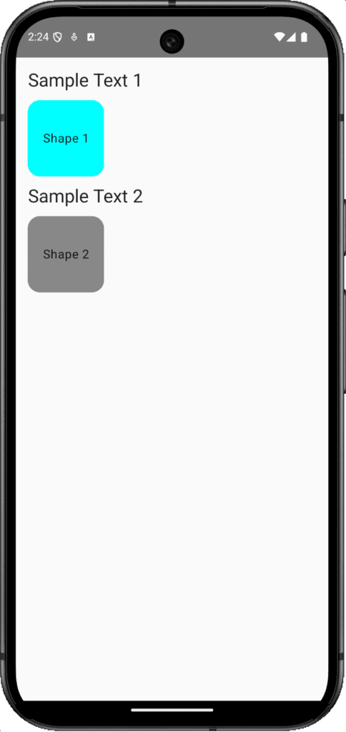
1. Arrangement.Top – Start the children’s elements from the Top of View.
Code:
|
1 2 3 4 5 6 7 8 9 10 11 12 13 14 15 16 17 18 19 20 21 22 23 24 25 26 27 28 29 30 31 32 33 34 35 36 37 38 39 40 41 42 43 44 45 46 47 48 49 50 51 |
@Composable fun Dashboard() { Column( modifier = Modifier .fillMaxSize() .padding(16.dp), verticalArrangement = Arrangement.Top ) { Text( text = "Sample Text 1", style = TextStyle( fontSize = 24.sp, textAlign = TextAlign.Center ) ) Spacer(modifier = Modifier.height(12.dp)) Surface( shape = RoundedCornerShape(16.dp), color = Color.Cyan, modifier = Modifier.size(100.dp) ) { Box(contentAlignment = Alignment.Center) { Text("Shape 1", textAlign = TextAlign.Center) } } Spacer(modifier = Modifier.height(12.dp)) Text( text = "Sample Text 2", style = TextStyle( fontSize = 24.sp, textAlign = TextAlign.Center ) ) Spacer(modifier = Modifier.height(12.dp)) Surface( shape = RoundedCornerShape(16.dp), color = Color.Gray, modifier = Modifier.size(100.dp) ) { Box(contentAlignment = Alignment.Center) { Text("Shape 2", textAlign = TextAlign.Center) } } } } |
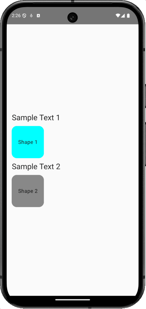
2. Arrangement.Center – Start the children’s elements from the center of the screen.
Code:
|
1 2 3 4 5 6 7 8 9 10 11 |
@Composable fun Dashboard() { Column( modifier = Modifier .fillMaxSize() .padding(16.dp), verticalArrangement = Arrangement.Center ) { // Same Widgets as above. } } |
3. Arrangement.Bottom – Push the children’s elements to the bottom.
Code:
|
1 2 3 4 5 6 7 8 9 10 11 |
@Composable fun Dashboard() { Column( modifier = Modifier .fillMaxSize() .padding(16.dp), verticalArrangement = Arrangement.Bottom ) { // Same widgets as above. } } |
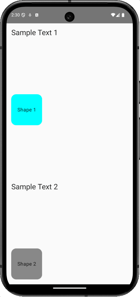
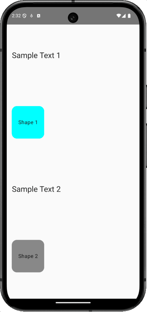
4. Arrangement.SpaceBetween – Set a space between each child element of the column widget, and push the first and last elements to the top and end.
Code:
|
1 2 3 4 5 6 7 8 9 10 11 |
@Composable fun Dashboard() { Column( modifier = Modifier .fillMaxSize() .padding(16.dp), verticalArrangement = Arrangement.SpaceBetween ) { // Widgets } } |
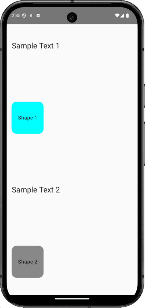
5. Arrangement.SpaceEvenly – Set equal space between each element from top to bottom.
6. Arrangement.SpaceAround – Set a fixed space around the Column widget.
Code:
|
1 2 3 4 5 6 7 8 9 10 11 |
@Composable fun Dashboard() { Column( modifier = Modifier .fillMaxSize() .padding(16.dp), verticalArrangement = Arrangement.SpaceAround ) { // Widgets Here. } } |
3. horizontalAlignment: The horizontal alignment aligns the child elements horizontally.
1. horizontalAlignment = Alignment.Start : Set the horizontal column widget children’s alignment from the start of the screen on the left side.
Code:
|
1 2 3 4 5 6 7 8 9 10 11 12 13 14 15 16 17 18 19 20 21 22 23 24 25 26 27 28 29 30 31 32 33 34 35 36 37 38 39 40 41 42 43 44 45 46 47 48 49 50 51 52 |
@Composable fun Dashboard() { Column( modifier = Modifier .fillMaxSize() .padding(16.dp), verticalArrangement = Arrangement.Top, horizontalAlignment = Alignment.Start ) { Text( text = "Sample Text 1", style = TextStyle( fontSize = 24.sp, textAlign = TextAlign.Center ) ) Spacer(modifier = Modifier.height(12.dp)) Surface( shape = RoundedCornerShape(16.dp), color = Color.Cyan, modifier = Modifier.size(100.dp) ) { Box(contentAlignment = Alignment.Center) { Text("Shape 1", textAlign = TextAlign.Center) } } Spacer(modifier = Modifier.height(12.dp)) Text( text = "Sample Text 2", style = TextStyle( fontSize = 24.sp, textAlign = TextAlign.Center ) ) Spacer(modifier = Modifier.height(12.dp)) Surface( shape = RoundedCornerShape(16.dp), color = Color.Gray, modifier = Modifier.size(100.dp) ) { Box(contentAlignment = Alignment.Center) { Text("Shape 2", textAlign = TextAlign.Center) } } } } |
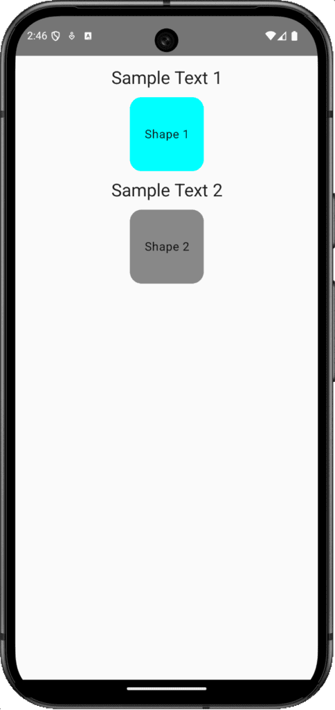
2. Alignment.CenterHorizontally – To set Column children vertically in center alignment.
Code:
|
1 2 3 4 5 6 7 8 9 10 11 12 |
@Composable fun Dashboard() { Column( modifier = Modifier .fillMaxSize() .padding(16.dp), verticalArrangement = Arrangement.Top, horizontalAlignment = Alignment.CenterHorizontally ) { // Same widgets } } |
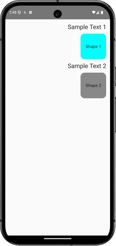
3. Alignment.End – Set the Column widget children’s horizontal alignment at the horizontal end, also known as the right side.
Code:
|
1 2 3 4 5 6 7 8 9 10 11 12 13 14 |
@Composable fun Dashboard() { Column( modifier = Modifier .fillMaxSize() .padding(16.dp), verticalArrangement = Arrangement.Top, horizontalAlignment = Alignment.End ) { // Same widgets here. } } |
Conclusion:
The Column widget is a versatile tool for creating customizable vertical layouts in Kotlin compose multiplatform. By mastering their properties, we can make efficient and responsive UI layouts in KMP KMM. Happy Coding.
