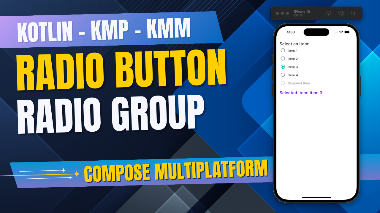
In today’s tutorial, we will learn about Integrating RadioButton in KMP KMM Compose Multiplatform for both Android & iOS platforms. In this step-by-step guide, we will retrieve the Radio button selected item, Customize the radio button Color, Size, Update the button selected item color, and implement disabled radio buttons. So let’s get started.
RadioButton in KMP KMM Kotlin Compose Multiplatform:
A Radio button is a circular button that can be selected when tapping and de-selected when its other items are pressed. Radio buttons are typically defined as part of the group. It is useful when the user needs to pick a single value from multiple choices. It ensures users only select one value at a time.
Implement Radio Button in KMP:
To integrate RadioButton in KMP Kotlin Compose Multiplatform, we will use its predefined RadioButton component.
|
1 2 3 4 5 6 |
var selected by remember { mutableStateOf(false) } RadioButton( selected = selected, onClick = { selected = !selected } ) |
Code explanation:
- selected: Contains the selected or not selected State.
- onClick: Calls every time the user taps on the radio button.
Source code:
|
1 2 3 4 5 6 7 8 9 10 11 12 13 14 15 16 17 18 19 20 21 22 23 24 25 26 27 28 29 30 31 32 |
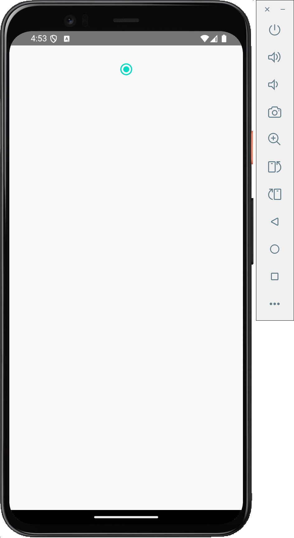
package com.app.test import androidx.compose.foundation.layout.Box import androidx.compose.foundation.layout.Column import androidx.compose.foundation.layout.fillMaxSize import androidx.compose.foundation.layout.fillMaxWidth import androidx.compose.foundation.layout.padding import androidx.compose.material.MaterialTheme import androidx.compose.material.RadioButton import androidx.compose.runtime.* import androidx.compose.ui.Alignment import androidx.compose.ui.Modifier import androidx.compose.ui.unit.dp @Composable fun App() { MaterialTheme { Box(modifier = Modifier.fillMaxSize().padding(16.dp)) { Column( Modifier.fillMaxWidth(), horizontalAlignment = Alignment.CenterHorizontally ) { var selected by remember { mutableStateOf(false) } RadioButton( selected = selected, onClick = { selected = !selected } ) } } } } |
Screenshot:
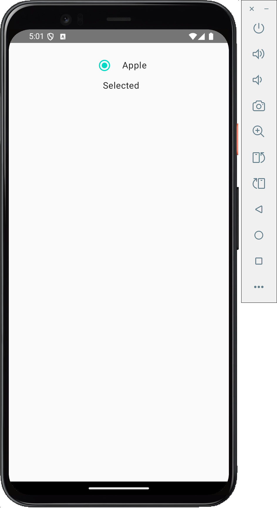
Adding lable to Radio button:
Adding a Label Title on the Radio button in KMP is very easy. We have to put the Radio Button in the Row widget and put the Text widget with it.
|
1 2 3 4 5 6 7 8 9 10 11 12 |
Row( verticalAlignment = Alignment.CenterVertically ) { RadioButton( selected = selected, onClick = { selected = !selected } ) Text( text = "Apple", modifier = Modifier.padding(start = 8.dp) ) } |
Source code:
|
1 2 3 4 5 6 7 8 9 10 11 12 13 14 15 16 17 18 19 20 21 22 23 24 25 26 27 28 29 30 31 32 33 34 35 36 37 38 39 40 41 42 43 44 45 46 47 |
package com.app.test import androidx.compose.foundation.layout.Box import androidx.compose.foundation.layout.Column import androidx.compose.foundation.layout.Row import androidx.compose.foundation.layout.fillMaxSize import androidx.compose.foundation.layout.fillMaxWidth import androidx.compose.foundation.layout.padding import androidx.compose.material.MaterialTheme import androidx.compose.material.RadioButton import androidx.compose.material.Text import androidx.compose.runtime.* import androidx.compose.ui.Alignment import androidx.compose.ui.Modifier import androidx.compose.ui.unit.dp @Composable fun App() { MaterialTheme { Box(modifier = Modifier.fillMaxSize().padding(16.dp)) { Column( Modifier.fillMaxWidth(), horizontalAlignment = Alignment.CenterHorizontally ) { var selected by remember { mutableStateOf(false) } Row( verticalAlignment = Alignment.CenterVertically ) { RadioButton( selected = selected, onClick = { selected = !selected } ) Text( text = "Apple", modifier = Modifier.padding(start = 8.dp) ) } Text( text = if (selected) "Selected" else "Un-Selected", modifier = Modifier.padding(start = 8.dp) ) } } } } |
Screenshot:
Customizing Radio button:
To customize radio button colours, a property RadioButtonDefaults.colors() is avaible. This property has 3 sub-properties:
- selectedColor: Color of Radio button when active – selected.
- unselectedColor: Color of Radio button when inactive or unselected.
- disabledColor: Disabled Radio button color.
|
1 2 3 4 5 6 7 8 9 10 11 12 13 14 15 16 17 18 19 |
var selected by remember { mutableStateOf(false) } Row( verticalAlignment = Alignment.CenterVertically ) { RadioButton( selected = selected, onClick = { selected = !selected }, colors = RadioButtonDefaults.colors( selectedColor = Color(0xff00BFA5), unselectedColor = Color.Gray, disabledColor = Color.LightGray, ), ) Text( text = "Apple", modifier = Modifier.padding(start = 8.dp) ) } |
Screenshot:

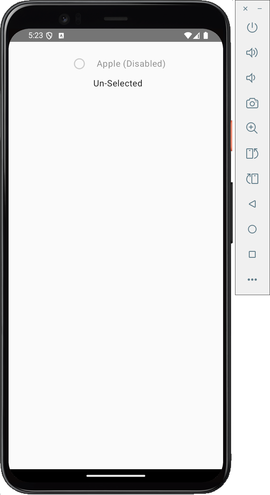
Disabled Radio button:
To create a disabled radio button in KMP, we have to use the enabled property. It supports True and False values.
|
1 2 3 4 5 6 7 8 9 10 11 12 13 14 15 16 17 18 19 20 21 22 |
var selected by remember { mutableStateOf(false) } Row( verticalAlignment = Alignment.CenterVertically ) { RadioButton( selected = selected, onClick = { selected = !selected }, enabled = false, // Disables the RadioButton colors = RadioButtonDefaults.colors( selectedColor = Color(0xffDD2C00), unselectedColor = Color.Gray, disabledColor = Color.LightGray, // Applies when disabled ), ) Text( text = "Apple (Disabled)", modifier = Modifier .padding(start = 8.dp) .alpha(0.5f) // Reduce opacity to indicate it's disabled ) } |
Screenshot:
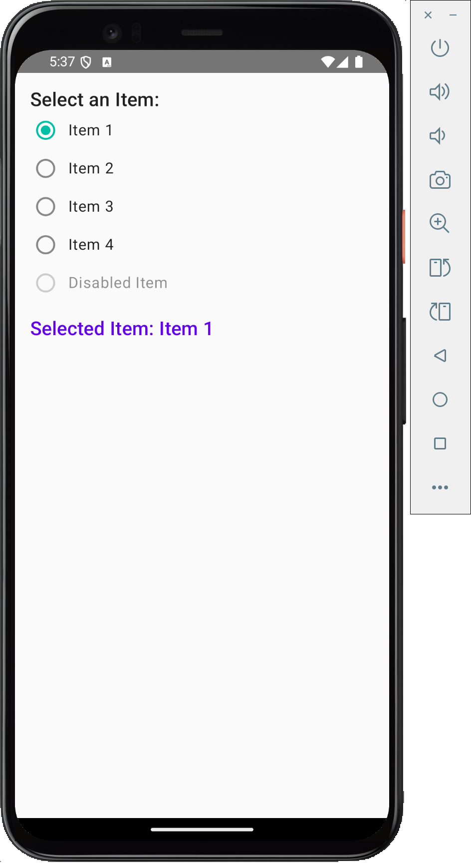
Implement Multiple Radio button(Radio Group) together:
To create a Radio group, first, we must make a State with multiple string items. These items contain Radio button items. We also have to make a selected item state that contains the index position of the radio button selected item. Ultimately, we will use the ForEach loop to render all the items.
Complete source code for App.kt file:
|
1 2 3 4 5 6 7 8 9 10 11 12 13 14 15 16 17 18 19 20 21 22 23 24 25 26 27 28 29 30 31 32 33 34 35 36 37 38 39 40 41 42 43 44 45 46 47 48 49 50 51 52 |
val options = listOf("Item 1", "Item 2", "Item 3", "Item 4", "Disabled Item") var selectedColor by remember { mutableStateOf(options[0]) } Column( modifier = Modifier.padding(16.dp) ) { Text("Select an Item:", style = MaterialTheme.typography.h6) options.forEach { color -> val interactionSource = remember { MutableInteractionSource() } Row( verticalAlignment = Alignment.CenterVertically, modifier = Modifier .fillMaxWidth() .padding(vertical = 4.dp) .clickable( enabled = color != "Disabled Item", onClick = { selectedColor = color } ) ) { RadioButton( selected = (color == selectedColor), onClick = { selectedColor = color }, enabled = color != "Disabled Item", colors = RadioButtonDefaults.colors( selectedColor = Color(0xff00BFA5), unselectedColor = Color.Gray, disabledColor = Color.LightGray ), modifier = Modifier .size(32.dp) .padding(4.dp), interactionSource = interactionSource ) Text( text = color, style = MaterialTheme.typography.body1, modifier = Modifier .padding(start = 8.dp) .alpha(if (color == "Disabled Item") 0.5f else 1f) ) } } Spacer(modifier = Modifier.height(16.dp)) Text( text = "Selected Item: $selectedColor", style = MaterialTheme.typography.h6, color = Color(0xFF6200EA) ) } |
Screenshot in Android device:
Screenshot in iOS device:
